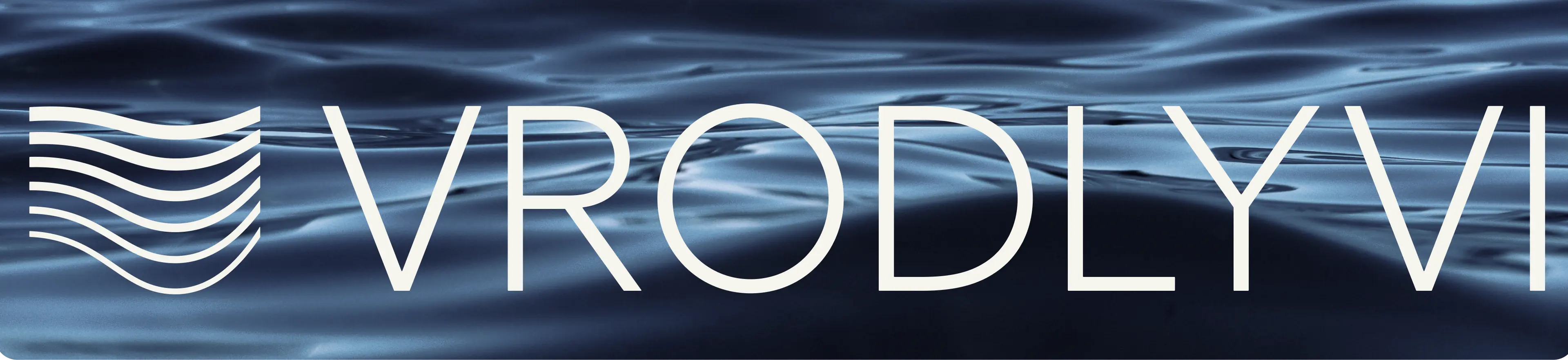
Vrodlyvi

Services
Client
year
Brand development & Identity
Vrodlyvi
2023
Awards
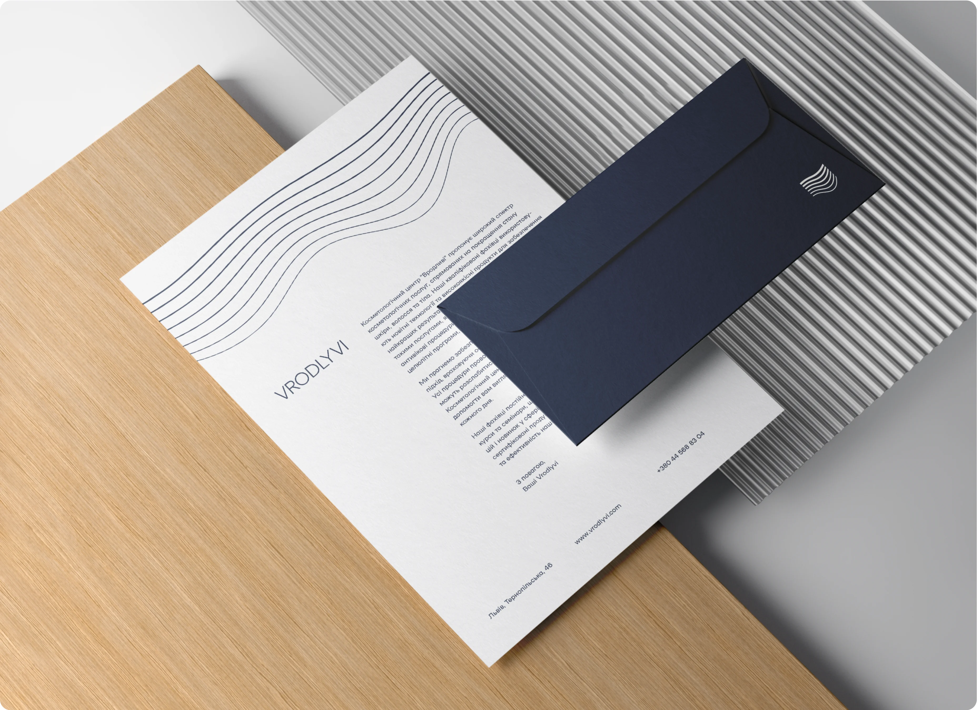
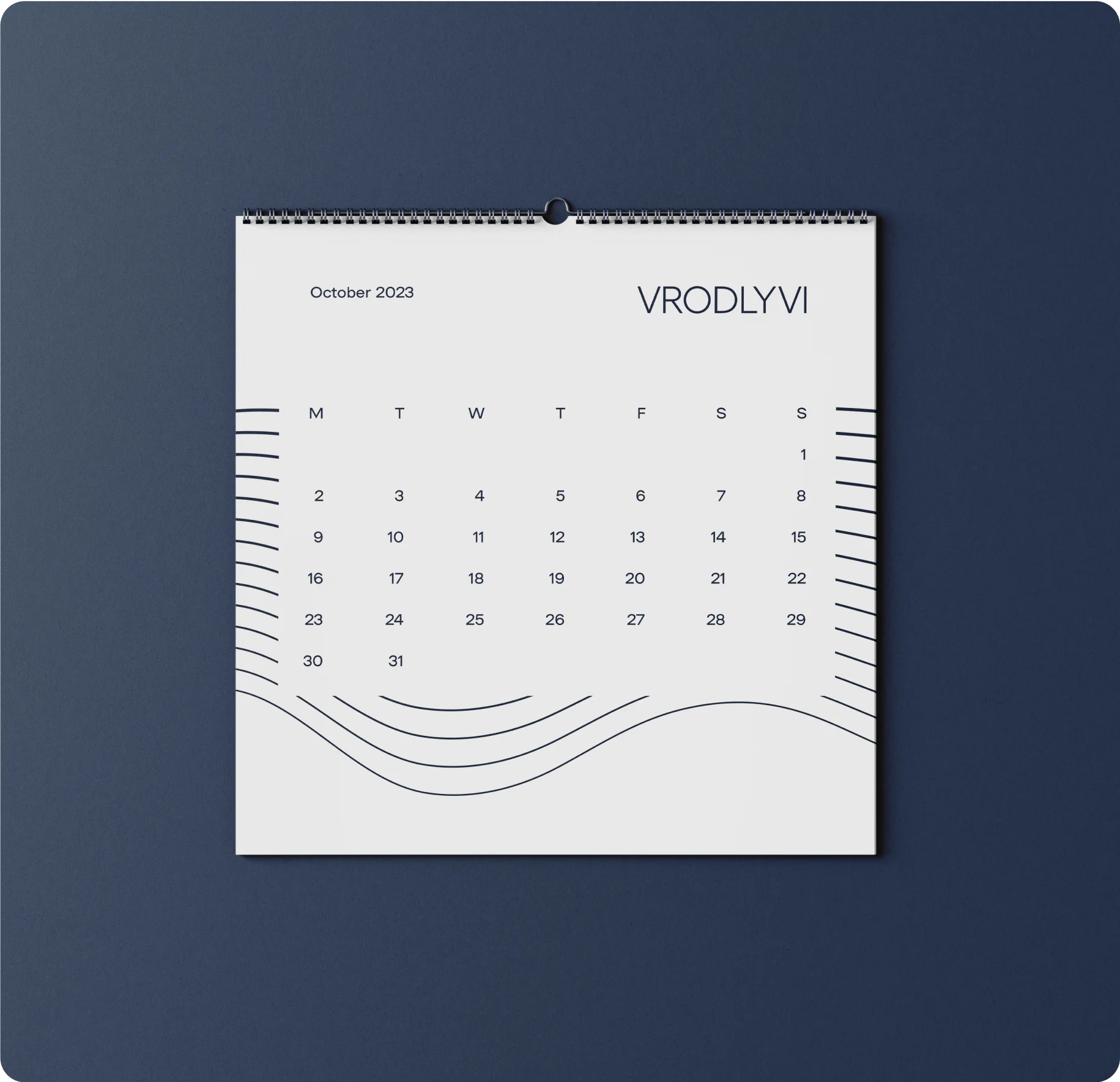
Vrodlyvi is a modern antiage center with latest technology trends and deep philosophy
.png)
Overview
For Vrodlyvi we created branding that includes naming, strategy, ToV and brand identity
Challenge
The client's existing brand identity was a stark mismatch with its aspirational image. The dated logo, generic emblem and pastel colour palette failed to convey the brand's youthful, futuristic and intelligent personality.
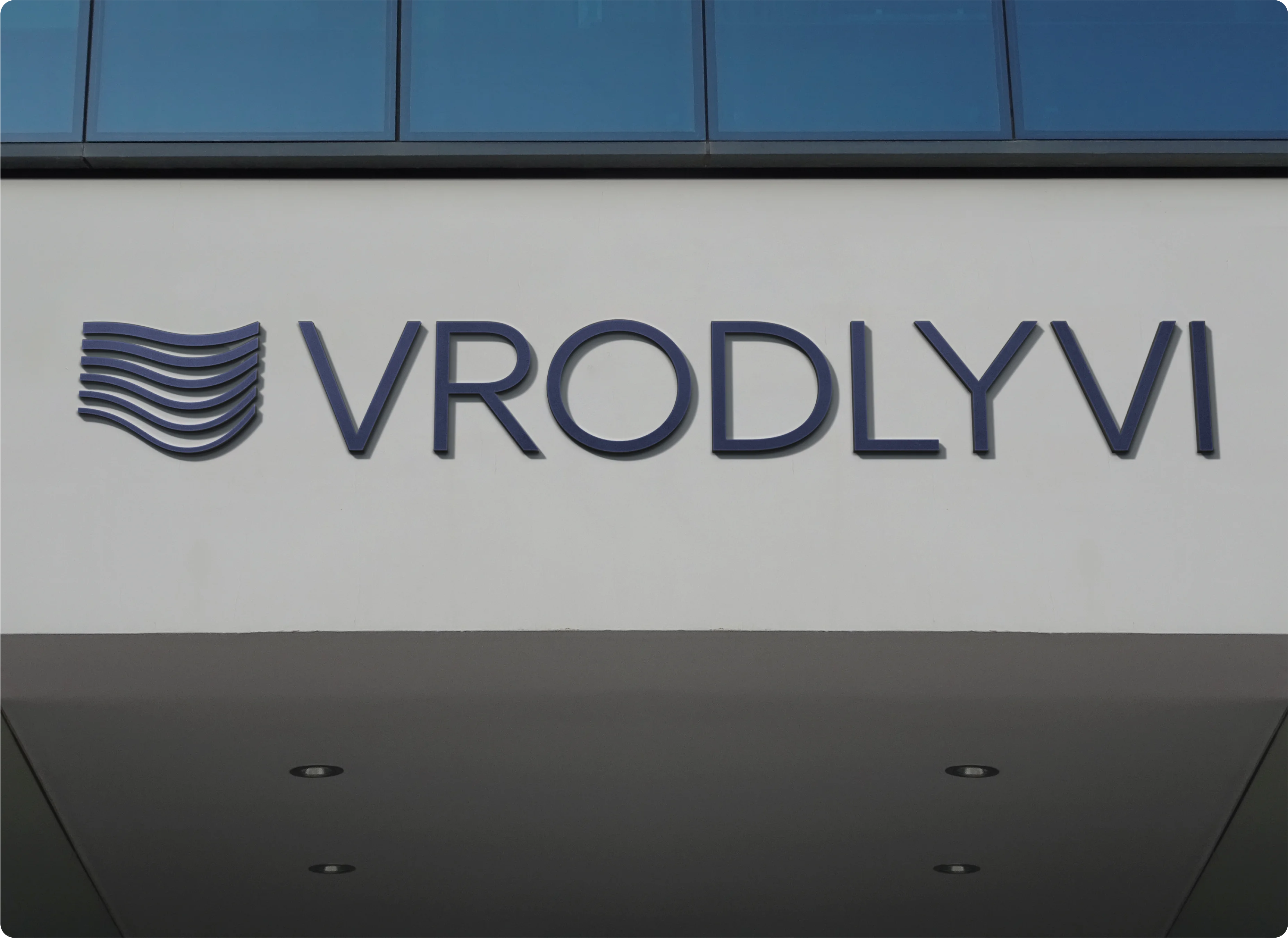
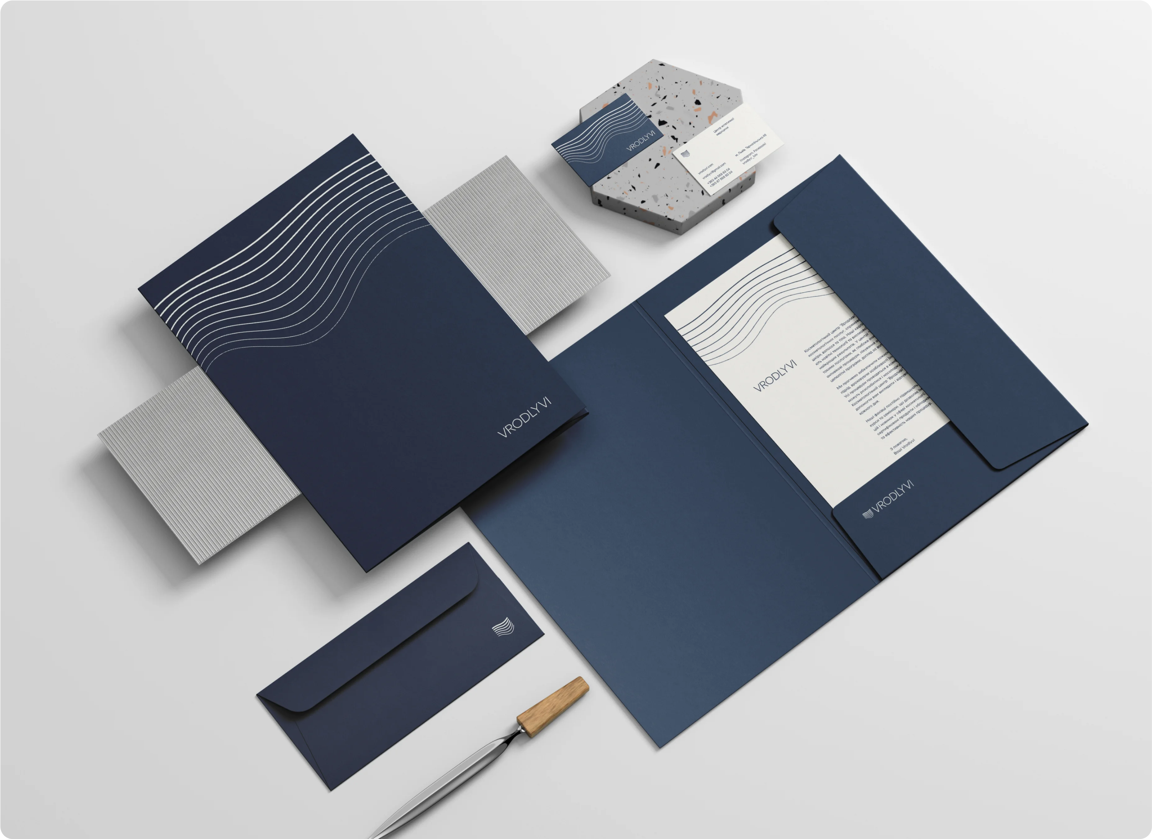
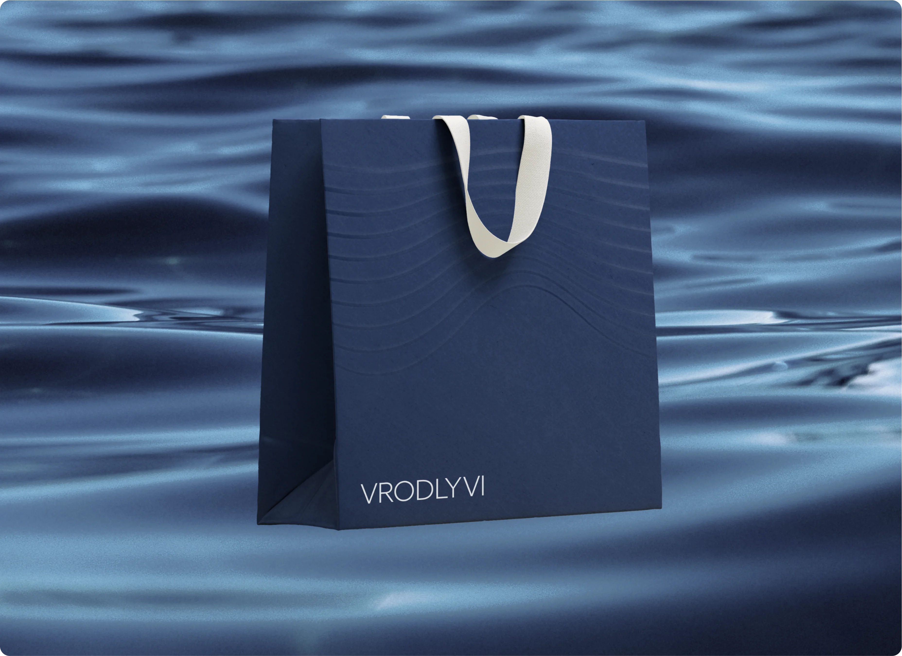
The Solution
We created a new identity that captured the brand's dynamic essence. The logo features a series of sleek, wavy lines that symbolise the endless possibilities of technology. The deep, dark blue colour evokes confidence and stability, reminiscent of the night sky and the infinite universe.
The colour also represents our commitment to empowering our clients through personalised treatments and cutting-edge technology.


client review

You might also like
Every brand has its own unique story, just like human beings. Our aim is to nurture brands and help them grow.

Forbes

KFC

Pilot Republic
Let's create something amazing together!

Prefer to chat?
Schedule a call with Volodymyr
