How to Optimize Website Components for Better Conversion Rates
Getting Real About Conversion Rate Optimization
Conversion rate optimization – let's just call it CRO – isn't some mystical marketing unicorn. It's basically the art of convincing more website visitors to actually do what you want them to do. And here's the thing: component-level CRO takes that same philosophy and applies it to individual pieces of your site. Think your hero section, that pricing table everyone argues about, or those forms that make people want to throw their laptops out the window.
The business case? Pretty straightforward. Instead of burning cash on more traffic through SEO campaigns or paid ads, you're squeezing better results from the visitors you already have. Smart, right?
What this actually looks like in the real world
CRO isn't a "set it and forget it" website makeover. It's more like a continuous cycle of measuring stuff, learning from what happened, then testing changes that remove friction while making your offer more emotionally compelling.
People might want to:
- Buy something from your online store
- Sign up for your service or newsletter
- Grab that white paper you've been promoting
- Register for your upcoming event
Here's where it gets tricky: fixing one thing can break another. Shortening a form might boost submissions, but those leads could be lower quality. That's why you need to define what "winning" means before you start tinkering.
Reading user behavior like a detective story
Behavioral data reveals the gap between what people intend to do and what actually happens. That's where websites either click into place or completely fall apart. Don't rely on just one data source – any single view can mislead you.
Try these diagnostic tools to understand how customers really behave:
- Heatmaps show where users click and scroll (plus what they completely ignore)
- Session recordings reveal friction points and moments of hesitation during important tasks
- Form analytics pinpoint exactly where users bail out, whether it's a specific field or validation error
Pro tip: make sure someone owns each piece. Designers usually handle component changes, marketers tackle messaging, and analysts or product folks manage measurement. Connect your insights to clear hypotheses like "If our hero section explains the outcome in one crisp sentence, more visitors will make it to pricing."
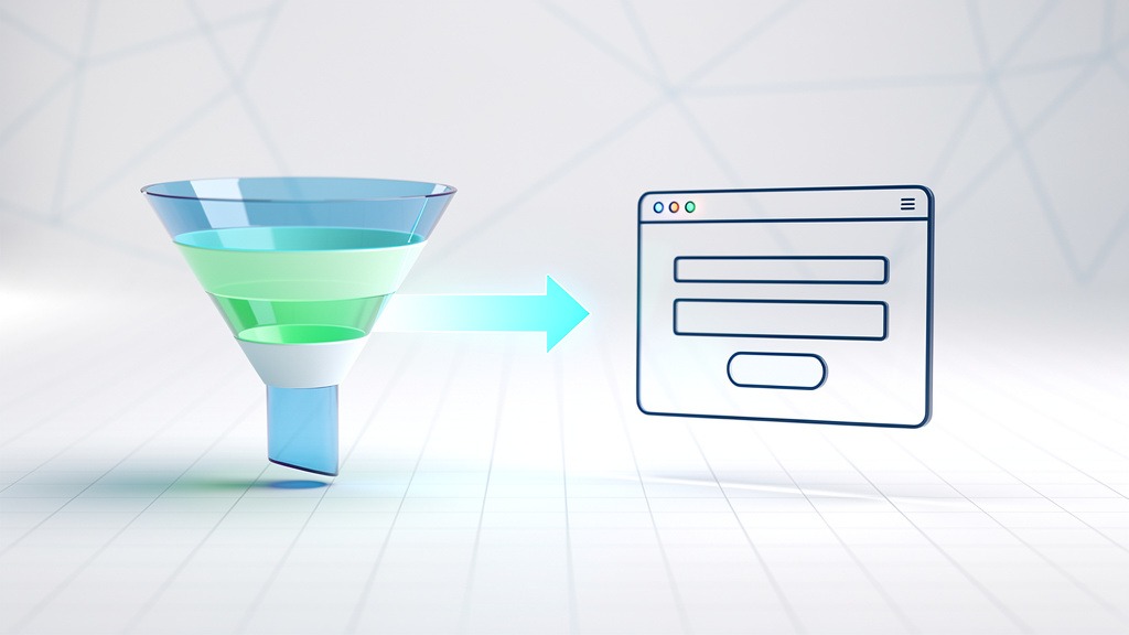
Connecting conversion funnels to actual user journeys
A conversion funnel maps out the steps leading to completion, while a user journey describes what that experience actually feels like. Use these stages to match components with user intent:
- Awareness: headlines, value propositions, social proof, educational content
- Consideration: comparison sections, pricing details, FAQs, case studies, feature breakdowns
- Conversion: checkout flows, demo booking, forms, trust signals, error handling
Focus your optimization efforts by spotting where people drop off in the funnel, then tackle the component that's blocking progress.
How AI can actually help and without taking over
AI enables dynamic personalization, smarter testing tools, and predictive analytics for identifying high-value user segments. But here's the catch: personalization without proper tracking creates fake winners. Always validate AI-generated ideas with controlled tests and clear audience segments.
Now that we've covered CRO fundamentals, let's dig into the specific website elements that actually drive conversions.
Finding the Website Elements That Actually Convert
Conversion elements are the specific website components that guide visitors toward taking action. On business sites, these elements shape the entire journey from first impression to final commitment – whether that's making a purchase, booking a demo, or subscribing to your service. The fastest way to improve? Take inventory of the high-converting components that influence decisions, then evaluate how each one reduces friction and builds confidence.

Key conversion-focused components usually include:
- Messaging components like hero sections, value propositions, and benefit blocks
- Action elements such as CTAs, lead forms, checkout steps, and scheduling widgets
- Trust builders including testimonials, case studies, security badges, and guarantees
- Clarity helpers like navigation, pricing tables, and comparison charts
Components that spark interest at the top of the funnel
Your landing page hero, supporting copy, and visual hierarchy need to create emotional clarity fast. Who's this for? What changes for the customer? What should they do next? These elements don't directly "convert" anyone, but they prevent that silent leak where visitors bounce before understanding your value.
Reality check: when messaging feels vague or your primary CTA competes with secondary links, attention gets scattered and your conversion funnel becomes impossible to measure accurately.
Components that capture and qualify interest
Lead capture elements – newsletter signups, demo requests, content download forms – often drive micro conversions that support bigger macro conversions down the line. Think closing a sales call or upgrading to a paid plan.
Workflow tip: assign clear ownership per component. Marketing handles the offer and email follow-up, product or growth owns onboarding steps, and engineering manages performance and form reliability.
Components that transform trust into commitment
On e-commerce sites, product pages, reviews, shipping details, and checkout design directly impact purchasing decisions. Across most business sites, social proof and transparent pricing improve user experience while lowering acquisition costs and protecting revenue by making decisions feel safer.
Balance to watch: adding reassurance can help, but too much content slows down scanning and dilutes your main CTA.
Why optimizing these elements matters for your bottom line
Component optimization maximizes ROI from existing traffic because more visitors complete valuable actions without increasing ad spend. It can also lower customer acquisition costs by reducing wasted clicks and improving lead quality. Plus, component-level tracking reveals valuable customer insights – like which messages drive form starts versus completions – so teams can design with evidence instead of assumptions.
With a clear picture of conversion-focused website components, let's explore how to effectively optimize these individual elements.
Smart Strategies for Component Optimization That Actually Work
Optimizing components means treating each on-page element as a decision moment, then improving the moments that most strongly influence conversions. In practice, the biggest gains come from prioritizing a small set of website elements and testing them systematically, rather than redesigning everything at once.
Start by defining what conversion means for you
A conversion is a completed desired action – purchasing a product, registering for an event, subscribing to a service, downloading a white paper, or joining your email list. Macro conversions are your primary goals (like making a purchase). Micro conversions are supporting goals (like clicking "View pricing" or starting a form) that move users forward in your funnel.
Track improvement with this formula: conversion rate = (number of conversions ÷ number of visitors) × 100. Tie each component to a measurable action and conversion relationship, so design discussions stay grounded in outcomes rather than opinions.
Identify which components deserve attention first
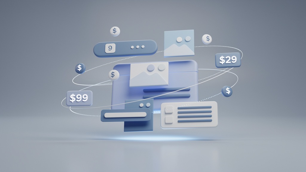
Conversion-critical components are the interface pieces that directly shape commitment, clarity, and momentum. Common examples include value propositions in headers, landing page CTAs, lead capture forms, pricing tables, trust signals, and checkout steps.
Prioritize your testing using this practical filter:
- Impact: Does this component directly influence a macro conversion?
- Friction: Does it create hesitation or extra work?
- Reach: How many visitors see it in normal traffic flow?
Workflow note: assign ownership by component – design handles clarity and hierarchy, engineering manages performance and form behavior – so tests ship consistently.
Step-by-step optimization workflow that works
- Pick one component and one goal. Example: landing page hero CTA tied to "Request a demo."
- Write a hypothesis. "If the header clarifies who this offer serves, more visitors will click the primary CTA."
- Reduce cognitive load. Tighten your value proposition, make the primary CTA visually dominant, remove competing links near decision points.
- Make forms feel effortless. Ask for minimum required information, add helpful field labels, use inline validation to prevent dead ends.
- Build trust where risk is felt. Place proof near pricing, forms, and checkout – testimonials near purchase decisions work well.
- Test and measure against business metrics. Track conversion rate changes and monitor cost per acquisition so "more leads" doesn't become "more expensive leads."
Trade-off to consider: aggressive pop-ups can boost micro conversions short-term but damage user experience and hurt downstream macro conversions if they interrupt user intent.
As you implement these optimization strategies, understanding what success looks like becomes crucial for measuring effectiveness.
What Actually Counts as a Good Conversion Rate
A "good" conversion rate is the percentage of visitors who complete your desired action, but "good" depends entirely on context. A landing page collecting white paper downloads won't behave like an e-commerce store pushing product sales. The most useful benchmark matches your business goals, traffic quality, and funnel stage.

Figuring out what's good for your specific website
Good conversion rates depend on three key variables: industry, traffic source, and business intent. Email traffic is often warmer than broad awareness campaign traffic, so the same page can convert differently without any design "problem."
Quick framing to keep in mind:
- Macro conversions are revenue or pipeline outcomes (product purchases, service subscriptions)
- Micro conversions are intent signals (event registrations, content downloads)
Reality check: benchmarking macro conversions against micro conversions creates misleading conclusions because the user's commitment level isn't comparable.
Industry benchmark ranges to use as starting points
| Sector | Common primary conversion | Benchmarking notes |
|---|---|---|
| --- | --- | --- |
| E-commerce | Product purchases | Sensitive to checkout friction, shipping clarity, trust signals |
| SaaS | Service subscriptions or trial starts | Heavily influenced by pricing presentation and onboarding clarity |
| Lead generation | Event registrations or contact requests | Depends on form length and perceived value exchange |
Setting realistic targets and improving them
- Define one primary desired action per page, then list supporting micro conversions
- Segment conversion rates by traffic source (paid, organic, email)
- Choose a target based on your best-performing segment, then expand improvements outward
- Run component testing on elements closest to commitment (CTA blocks, forms, pricing, checkout steps)
Workflow note: designers own clarity and emotional connection, marketers own messaging and offers, analysts own measurement. The trade-off is speed versus confidence – faster tests teach quickly, but longer tests reduce false positives. Small percentage lifts still matter because improvements compound across multiple funnel steps, creating durable competitive advantages powered by customer insights.
While pushing for higher conversion rates, it's equally important to avoid common pitfalls that can derail your optimization efforts.
Optimization Mistakes That Kill Conversions And How to Avoid Them
Component conversion work fails most often because teams chase visual changes without testing discipline. The fix? Treat every component update as a measurable bet tied to a specific desired action, then validate that bet with structured experiments. Done right, you don't just increase sales – you also boost brand recognition through a more seamless, trustworthy experience.
Mistake one: Testing without proper experiment design
A/B testing compares two versions of a single component to see which performs better – like testing a control CTA button against a variation. Multivariate testing examines multiple variable combinations simultaneously (headline, image, form layout) to understand how elements interact, but it requires more traffic and stronger measurement discipline.
Use A/B testing with hypothesis thinking: a hypothesis is a written prediction stating what change will be made, why it should affect customer behavior, and which metric will confirm success.
Avoid false wins by waiting for statistical significance, meaning the result is unlikely to be random noise. In practice, low or volatile traffic can make "winning" results flip later, so resist ending tests early just because a chart looks exciting.
Checklist for cleaner component testing:
- Write one hypothesis per component and one primary metric per hypothesis
- Define control and variation before launch, avoid mid-test edits
- Run tests long enough to reach statistical significance, especially for low-volume goals like event registrations
- Document learnings in a shared log owned by design, product, and analytics
Mistake two: Optimizing isolated components outside funnel context
A beautiful component can still leak value if it conflicts with the conversion funnel stage. Pushing an aggressive checkout prompt may hurt e-commerce visitors who need reassurance, while a white paper offer may outperform a demo ask for colder email traffic.
Fix: map each component to one intent (product purchase, service subscription, quote request), then align copy, proof, and friction level to that intent.
Mistake three: Using AI without guardrails or segmentation planning
AI can accelerate dynamic personalization, but personalization without strategy feels inconsistent and erodes trust. Use AI-powered testing tools to surface patterns, then apply predictive analytics to identify high-value user segments and tailor components carefully – like different value propositions for returning versus first-time visitors.
Trade-off: deeper personalization can improve relevance, but it also increases complexity. Assign clear ownership for rules, review cadence, and brand consistency.
To solidify your understanding, let's address frequently asked questions about optimizing website components for conversion.
What Exactly Are Conversion Elements on a Website?
Conversion elements are specific page components that guide website traffic toward desired actions. A conversion element can be visual (like a CTA button) or structural (like a checkout step), but each one exists to move visitors forward in your conversion funnel. In component conversion optimization, these elements become measurable decision points, not just decoration.
Core conversion elements to inventory on any site
Start by listing the website conversion elements that influence commitment on each landing page and key pathway:
- Value proposition components: hero headlines, subheads, benefit lists, social proof
- Action components: primary CTAs, secondary CTAs, sticky header buttons
- Capture components: lead forms, newsletter opt-ins, white paper download gates
- Trust components: testimonials, reviews, security badges, FAQs, refund policy snippets
- Purchase components: product cards, pricing tables, shopping carts, checkout steps
- Retention components: email signups, account creation, post-purchase upsell modules
These components create both macro conversions (product purchases) and micro conversions (pricing clicks, service subscriptions, event registrations).
Recognizing high-converting components in context
High-converting components reduce friction and increase clarity exactly when users hesitate. In practice, that means optimizing for website usability and customer behavior together – what people need to understand, feel, and do within seconds.
Reality check: improving one element can hurt another. Adding more form fields may increase lead quality but often reduces submissions.
Quick workflow for component testing
Ownership matters. Designers craft the experience, but analytics and QA must verify behavior.
- Pick one desired action per page
- Map components that influence that action
- Run component testing on one element at a time, so results stay interpretable
Next, let's focus on component-level optimization versus general CRO theory.
Why Component-Level Work Beats General CRO Theory
Component-level optimization bridges CRO theory and real results by improving specific on-page parts that block desired actions. Component conversion optimization focuses on how individual elements behave on landing pages or across e-commerce stores, transforming unpredictable website traffic into measurable progress.
Why general CRO advice often leaves teams stuck
General advice explains conversion funnels but rarely tells teams which component to change next, or how. Component work translates customer behavior into design decisions across website conversion elements, from first click to checkout, including paths like content downloads or email marketing responses.
Making component conversion work operational
Use this workflow to identify high-converting components and fix weak ones:
- Assign ownership: design crafts experience, analytics validates outcomes, engineering ships changes
- Measure both micro conversions (CTA clicks) and macro conversions (product purchases, event registrations, service subscriptions)
- Run component testing one element at a time to protect website usability and isolate cause and effect
Trade-offs worth planning for
Component testing moves slower than sweeping redesigns, but it reduces ambiguity and prevents "pretty" changes that quietly hurt conversions.
Let's answer the most common questions teams ask about website component conversion.
Your Most Asked Questions About Website Component Conversion
What exactly is component-level conversion rate optimization?
Conversion rate optimization increases the percentage of visitors who complete desired actions. Component conversion optimization narrows that focus to individual page parts, so teams can improve outcomes without reinventing entire landing pages.
- Common desired actions: product purchases, event registrations, service subscriptions
- Component targets often include: form fields, pricing cards, CTAs, navigation, trust blocks
Caveat: gains can mislead if tracking is inconsistent. Align analytics definitions before making design decisions.
Example: If a white paper download form underperforms, optimize the form component before rewriting every section.
Which conversion elements should you optimize first?
The best starting point is the set of website conversion elements that sit closest to commitment in your conversion funnel. Prioritize components that influence intent, reduce doubt, and remove friction, then validate changes with component testing.
- Prioritize by impact: components tied to macro conversions, like checkout and lead forms
- Support with micro conversions: scroll depth, CTA clicks, email signups, "add to cart"
- Protect website usability: speed, readability, accessibility, error handling
Workflow tip: assign one owner to measurement (analytics) and one to implementation (design and development) to prevent ambiguous results.
Your Action Plan for Component Conversion Success
Conversion-critical components are on-page parts that directly influence desired actions. In component conversion optimization, that means treating CTAs, forms, headers, value propositions, pricing blocks, and checkout steps as measurable decision points, not decoration. The goal? Improve high-converting components without rebuilding the entire experience.
Define what actually matters in your conversion funnel
Start by naming the outcome and stage: macro conversions (product purchases, service subscriptions) versus micro conversions (event registrations, white paper downloads, email signups). This framing clarifies which website conversion elements deserve attention first, and how customer behavior should be measured across the journey.
Prioritize components with a test-first approach
Use this prioritization checklist for component testing:
- Impact: Does the component sit on a high-traffic landing page or key e-commerce step?
- Friction: Does website usability break down (confusing forms, weak CTAs, unclear pricing)?
- Confidence: Do recordings, support tickets, or feedback consistently point to the same issue?
- Effort: Can designers and developers ship a controlled change without replatforming?
Trade-off: faster tests move quickly, but narrow tests often require more iterations for strong confidence.
Apply practical optimization tactics and learn from results
Examples of high-converting components include specific CTA labels, short forms with clear error states, benefit-led headers, and trust-rich checkout summaries. Optimize by tightening value propositions, reducing form friction, clarifying hierarchy, and aligning messaging to intent.
Business outcomes often include lower customer acquisition costs, stronger revenue per visitor, maximized ROI from existing traffic, improved brand perception, and valuable customer insights that guide future design.
Transform your website into a conversion-generating machine by implementing these strategies systematically.