
Business Website Navigation Design Best Practices and Examples
Look, I've watched countless websites lose potential customers in the first fifteen seconds. Not because their product sucks or their pricing's off—but because visitors can't figure out where the hell they're supposed to click next. Effective website navigation isn't just about pretty menus; it's the difference between a confused bounce and a confident conversion.
When someone lands on your site, they're already halfway out the door. A clear navigation menu doesn't just reduce hesitation—it eliminates the mental friction that makes people give up before they even start. Plus, search engines actually use your navigation structure to understand what matters most on your site, which can boost your discoverability over time.
Here's the thing: navigation isn't decoration. It's psychology. It's the decision path you're deliberately crafting for every single visitor.
What website navigation means in business website design
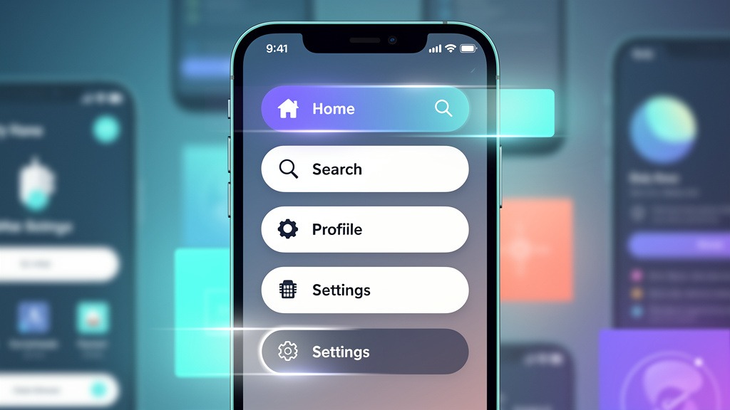
Website navigation is basically your site's GPS system—the collection of links that helps people move around and, just as importantly, understand where they are at any moment. You've got your header navigation sitting at the top of every page, footer navigation anchoring the bottom, and sometimes sidebar navigation running along the edge. Each serves different purposes depending on what someone's trying to accomplish.
But here's where most businesses screw this up: they organize their navigation around how their company works internally instead of how their customers actually think. When your menu labels match the real questions bouncing around in a visitor's head, something magical happens. People self-qualify faster, and when they finally hop on a sales call, they're already warmed up and ready to talk business.
I've seen this play out dozens of times. The companies that nail their navigation structure? Their sales teams spend less time explaining basics and more time closing deals.
Core navigation components to know
Most business sites layer these elements together, though not always successfully:

- Primary navigation menu handles the heavy lifting—Solutions, Pricing, About, Contact—the stuff people came looking for
- Secondary navigation supports the main paths with things like Industries, Resources, Partners
- Local in-page navigation helps with those marathon pages where you need jump links to sections
- Footer links build trust and catch the completionists—legal pages, support docs, key resources
Now here's a trade-off you need to plan for: more links can definitely increase findability, but crowded menus turn decision-making into a slog. Nobody wants to play "guess the right category" when they're trying to solve a problem.
Why navigation impacts search engines and real revenue
Search engines are basically following breadcrumbs through your site, trying to figure out what's important and how everything connects. Clear categories and consistent link pathways make that job easier. Confusing structures? They bury your important pages where nobody will ever find them.
But there's a practical constraint that'll bite you if you're not careful: those heavy menus loaded with JavaScript animations and massive images can slow everything down. Page speed matters—a lot. When someone's thumb is hovering over your navigation and it takes three seconds to respond, you've already lost them.
You know what separates the sites that feel effortless from the ones that make you want to throw your laptop? It's the behind-the-scenes architecture work that nobody sees but everyone feels. Website architecture is how you organize and connect pages so people can actually predict where to go next. When it's done right, every click feels intentional instead of like a desperate guess.
Define website architecture and user flow for business goals
Website architecture is your content blueprint—the master plan that informs every navigation decision across your entire site. Start by identifying the top things people actually want to do when they land on your pages. Maybe it's "compare solutions," "check pricing," or "book a demo." Whatever it is, each intent needs a clear destination.
Choose a structure type that matches how customers think
Most business sites borrow from a handful of familiar patterns. The trick is picking the one that mirrors how people make decisions, not how your org chart happens to be structured.
Hierarchical works great when you need clear parent-child relationships—think of it as a family tree for your content. It's scalable and keeps your primary navigation clean.
Sequential is perfect when education has to happen in a specific order. Like when someone needs to understand the problem before they can appreciate your solution.
Hub and spoke puts a central page at the center with supporting detail pages radiating out. This builds topic authority and works well for secondary navigation.
Webbed structures have cross-links everywhere, which is fantastic for discovery but can confuse people if you're not disciplined about it.
Trade-off alert: more cross-linking definitely increases exploration, but it can also create those "Wait, where am I?" moments that kill momentum.
Build the architecture in seven practical steps
One more thing: those flashy navigation systems with bells and whistles can actually hurt the user experience if they make mobile menus laggy or unresponsive.
User-friendly navigation creates that "this site gets me" feeling within the first few seconds. Clear choices, predictable labels, reliable search. Your navigation menu should guide decisions, not turn every click into a puzzle-solving exercise. The strongest menus translate all that architecture planning into a visible path that works for both humans and search engines.
Start with a navigation system, not a list of links
A navigation system is the coordinated dance between your header navigation, footer navigation, sidebar navigation, and those helpful jump links that keep long pages manageable.
Your primary navigation menu is the main event—those top-level categories that usually live in the header. Secondary navigation supports the primary paths with contextual options, like a sidebar in your resource hub or a solutions sub-menu that appears when needed. Local in-page navigation helps people scan those spec sheets and pricing pages without losing their minds. And SEO-friendly navigation aligns your labels and internal links so search engines don't have to guess what you're talking about.
Build your menu in seven implementation steps
- Name the top tasks people actually come for—"Book a demo," "Compare plans," "Contact sales"
- Group pages by intent, then validate labels using real stakeholder language instead of internal jargon
- Draft your primary navigation with a tight set of categories that match those intents
- Add secondary navigation only where it genuinely reduces scrolling or clarifies complex sections
- Design predictable header navigation with clear visual hierarchy and one standout call to action
- Use footer navigation for reassurance links and deep pages that matter but shouldn't compete for header space
- Include search functionality early, especially when your content volume is meaningful, and put it somewhere visible and thumb-friendly
Guardrails that protect speed and revenue outcomes
Use these checks during design reviews, since navigation usually spans multiple team members:
Avoid microscopic links, especially in headers and mobile menus. Nobody has time for precision tapping.
Keep interactions lightweight. Heavy JavaScript menus can absolutely tank your page load times.
Make sure navigation labels actually match your page headlines. Mismatches break trust faster than almost anything else and can seriously hurt conversion rates.
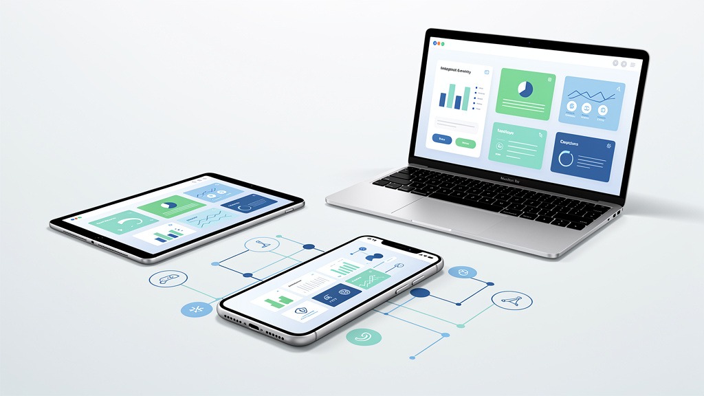
Mobile navigation is where trust gets earned or destroyed in about three seconds. Your mobile design needs to help someone choose a path quickly, with tap-friendly targets, crystal-clear labels, and search that actually works. Advanced elements can definitely enhance the experience, but every single enhancement needs to protect speed, clarity, and accessibility.
Craft a mobile header navigation that feels effortless
Your header is prime real estate on mobile—it frames every decision someone makes. Focus on your primary navigation menu for the most important tasks, then tuck utility links like login, support, or locations into secondary navigation.
Use a hamburger menu when your information architecture would otherwise turn your header into a crowded mess, but make sure the closed state still provides value. Strong mobile headers often include a visible search icon because search becomes the safety net when people can't guess the right category.
Use advanced elements with intention, not decoration
Advanced navigation patterns should reduce friction, not add digital fireworks. Sticky headers, smart search suggestions, and "recently viewed" shortcuts can create genuinely seamless experiences when implemented thoughtfully.
Balance your global navigation with helpful context cues:
- Jump links for those unavoidably long pages
- Footer navigation for trust-building and discovery
- Sidebar navigation for dense documentation or portals, typically on larger screens
Watch out for this: heavy menus stuffed with JavaScript, animations, and oversized images often slow down page loads, which damages both user experience and how search engines interpret engagement signals.
Step-by-step workflow for mobile-ready navigation
- Identify the top 3 to 5 mobile tasks, then map them to your primary navigation labels
- Add search functionality early, then test whether people prefer search or browsing for key journeys
- Prototype tap targets and spacing using real thumbs on actual devices
- Implement progressive enhancement—deliver core navigation first, then layer on advanced elements
- Assign clear ownership: UX defines labels and hierarchy, design polishes interaction states, engineering protects performance, content maintains link accuracy
For small business navigation, this approach keeps the experience purposeful and memorable without turning your menu into an impossible maze.
Navigation mistakes usually fail in two places simultaneously: people feel lost, and search engines can't figure out how your pages relate to each other. The fix rarely requires redesigning everything from scratch. The fix is building disciplined navigation that reflects real user tasks, loads fast, and stays consistent across every part of your site.
Mistake 1: Building navigation around your organization chart
Here's what happens: navigation breaks when your primary menu mirrors internal departments instead of the questions buyers actually bring to your site. Visitors end up hunting, backtracking, and eventually giving up because the labels don't match how they think about their problems.
Avoid it with this workflow:
- Start with the top customer intents—"Solutions," "Industries," "Pricing," "Resources," "Contact"
- Validate labels with your sales and support teams since they hear real customer language every day
- Keep each top-level item mutually exclusive so users don't have to guess where something might be hiding
Trade-off alert: fewer top-level links can feel restrictive to internal stakeholders, but clarity almost always improves user experience and reduces that annoying back-and-forth browsing behavior.
Mistake 2: Overbuilding mega menus and heavy effects
Mega menus can be incredibly powerful, but overstuffed mega menus loaded with JavaScript, animations, and massive images slow down page loads and bury the paths people actually need.
Use mega menus when you genuinely have many categories that belong under one logical label. Skip mega menus when your content is still evolving or constantly changing.
- Keep the first screen of your menu scannable with short, clear labels
- Don't hide critical pages behind multiple hover states that completely fail on touch devices
- Test with keyboard navigation to catch accessibility and focus issues before they become problems
Mistake 3: Misusing sticky headers and neglecting secondary navigation
Sticky headers help with orientation, but oversized sticky headers crowd your actual content and create accidental taps on mobile devices.
Pair a restrained header with supportive navigation layers:
- Secondary navigation for section-level choices
- Jump links for those marathon pages
- Footer navigation as a dependable safety net with key destinations and legal links
Quick prevention checklist:
- Can a brand-new visitor choose a path within a few seconds?
- Are tap targets large enough, with visible search where it makes sense?
- Do labels match buyer language instead of internal terminology?
- Do navigation elements work together instead of competing across different devices?
What is user friendly navigation
Q: What exactly makes navigation user-friendly? A: User-friendly navigation feels intuitive within seconds because labels match real tasks, paths feel predictable, and key routes appear consistently throughout your site design. You know you've won when visitors don't have to decode your navigation menu just to find pricing, products, or support.
Look for clear primary navigation labels, visible search functionality, and consistent header and footer navigation. Watch out for tiny tap targets, menu labels that shift between pages, and secondary navigation that users never discover because it's buried too deep.
Workflow hint: assign one person to own naming and placement decisions, and one person to handle taxonomy and how search engines crawl your paths.
What are the 7 parts of a menu
Q: What are the seven parts of a menu? A: There's no universal standard, but here's a practical way to review your website menu structure by mapping seven visible components that actually shape decision-making across devices.
- Primary navigation menu for your top-level choices
- Secondary navigation for supporting links like solutions by role or industry
- Header navigation utilities for search, login, contact, language options
- Footer navigation to repeat key paths and add legal and trust links
- Sidebar navigation for docs, portals, and dashboards
- Local in-page navigation with jump links within long pages
- States and feedback like active, hover, focus, and "you are here" cues
Trade-off to manage: deeper menus can reduce clicks, but they can also increase cognitive load if categories start overlapping.
What are the 4 types of website structure
Q: What are the four main types of website structure? A: During website architecture planning, teams typically choose one dominant pattern, then build navigation around it so both humans and search engines can follow the relationships.
Hierarchical uses categories and subcategories—really common for business navigation. Linear creates step-by-step journeys, perfect for onboarding or guided funnels. Webbed structures have cross-links everywhere, great for thought leadership hubs. Database or faceted structures use filters and tags to drive discovery, common for catalogs and large inventories.
Constraint to remember: heavy, script-driven menus can slow navigation rendering, so keep interactions lightweight, especially on mobile devices.
What are the 7 Cs of a website and the 7 basic parts of a website
Q: What are the 7 C's of a website? A: Different teams define the "7 C's" differently, but a useful checklist includes clarity, consistency, credibility, content, conversion, connection, and convenience. Use this list to sanity-check your copy, information architecture, and interaction design.
Q: What are the seven basic parts of a website? A: A practical audit set includes header, navigation, main content area, calls to action, supporting content (often in a sidebar), footer, and search or help entry points. In mobile navigation design, confirm these elements remain reachable without requiring pinching or precision taps.
Clear navigation isn't a finishing touch—it's a growth lever. The strongest business outcomes come from user-friendly navigation that matches real intent quickly, supports mobile design properly, and gives search engines a readable path for SEO purposes. Think of navigation as a strategic layer of your website design that transforms curiosity into confident clicks.
What to prioritize first
Start with solid website architecture planning so every page has a purposeful home, then express that logic through a crisp website menu structure. For business navigation, prioritize task-based labels like Solutions, Industries, Pricing, Support over internal organizational charts, then reinforce those choices with jump links on longer pages.
Navigation system checklist for modern business sites
Keep your primary navigation menu focused and push overflow into secondary navigation. Make header navigation consistent across all your templates. Use footer navigation for trust-building, legal pages, and deep links. Deploy sidebar navigation selectively for dense libraries and documentation. Include visible search functionality within your navigation menu. Balance rich menus with speed since heavy scripts can absolutely slow down user experience.
Ownership and iteration
Assign one person to review labels monthly—small changes compound over time. Remember this trade-off: mega menus can showcase breadth effectively, but they can also dilute focus if you don't test them with real users.
Implement these practices to transform your website's user experience and actually achieve your business objectives.


