How a Website Redesign Increased Online Sales by 156 Percent
Understanding Ecommerce Website Redesign Results
Here's the thing about redesigning an online store – it's not about making things prettier. Sure, aesthetics matter, but what really moves the needle is creating momentum that pushes hesitant browsers toward becoming actual buyers. When done right, a redesign becomes this strategic investment where every visual choice and user experience decision connects directly to conversions, revenue, and removing those annoying friction points (especially on mobile).
What counts as redesign results in a case study
You know what separates a real case study from marketing fluff? Structure. A credible website conversion case study follows Problem, Solution, Results – letting stakeholders trace cause and effect without guessing.
- Problem: Think high bounce rates on product pages, painfully slow load times, or checkout flows that somehow manage to lose people who were ready to buy.
- Solution: This involves targeted conversion improvements and UX fixes, all grounded in actual data and understanding how customers behave.
- Results: Quantifiable changes tied directly to specific modifications. None of that vague "better engagement" nonsense.
How to connect design changes to metric improvements
Start with a pre-redesign baseline. Sounds obvious, but you'd be amazed how many teams skip this step and then can't prove anything actually worked.
Track metrics that translate design efforts into real business impact:
- Conversion rate (but pair it with experience quality – high conversions from frustrated users won't last)
- Average order value
- Cart abandonment rate
For example, when you simplify a product page layout and clarify shipping info, you can report "conversion rate jumped from X to Y." Similarly, cutting checkout fields becomes "cart abandonment dropped from A to B" – once you've verified it in analytics, of course.
Measuring ROI and earning stakeholder buy-in
Website redesign ROI breaks down to this formula: (Gain from Investment - Cost of Investment) / Cost of Investment. Use this logic to build your business case, aligning goals with what executives actually care about – profit, efficiency, retention.
Pro tip: assign ownership early. Design lead owns UX hypotheses. Analytics owner verifies tracking works. Product owner approves goals. Here's what most people miss – tracking can completely break during migration, making your results meaningless. So measurement planning? That's part of the redesign process, not something you figure out later.
The data-driven foundation before design
Run a focused audit using heatmaps, session recordings, and analytics. Then map the user journey to pinpoint exactly where things go wrong on product pages, mobile, and within checkout.
Before we dive into our specific case study, let's explore the strategic approach that actually generates revenue.
Strategic Redesign Approach for Maximizing Online Sales
A revenue-driving redesign isn't a visual refresh. It's a structured program for conversion improvement across the entire buying journey. The goal? Guide high-intent buyers from discovery to checkout with fewer doubts, faster interactions, and clearer decisions (particularly on mobile). A disciplined process also protects existing successful elements – you want conversion rates to improve without accidentally breaking what's already working.

Start with a baseline and a shared definition of success
Success means measurable behavior change, not subjective preference. Anchor the work in thorough data analysis and customer insights, then translate findings into a concise set of decision rules.
- Baseline what truly matters: product page engagement, checkout drop-offs, mobile friction points, and load times.
- Assign ownership early: design leads experience, engineering owns performance, analytics validates outcomes, merchandising supplies product truth.
Trade-off you've got to accept upfront: faster launches reduce research time but risk overlooking the real reasons buyers hesitate.
Follow a structured redesign workflow
Use this step-by-step sequence to keep your online store focused on buyers, rather than internal opinions:
- Audit the current buying journey, mapping where high-intent buyers actually stall.
- Segment intent by entry path (search, ads, email, returning customers) to avoid one-size-fits-all mistakes.
- Apply 80/20 thinking, focusing first on the few screens driving most revenue – usually product pages and checkout.
- Create prototypes for critical mobile flows before refining desktop visuals.
- Validate with lightweight testing, including internal QA and customer feedback, to fix obvious friction.
- Implement with performance budgets to prevent load times from getting worse.
- Launch with comprehensive measurement plans and clear rollback criteria.
Practical constraint: content and tracking frequently break during migration. Protect analytics events and ensure every key step remains measurable.
Improve after launch with learning loops
A website conversion case study gains credibility when post-launch improvement is planned, not improvised. Treat the initial launch as version one, then run focused experiments based on observed behavior.
This strategic approach involves improving specific elements of the user journey, starting with product pages.
Improving Product Pages for Higher Conversion Rates
Product pages represent the moment of truth. This is where curiosity transforms into commitment. To boost conversion rates, a product page must quickly answer high-intent buyers' questions, reduce doubt, and make the next action feel inevitable. In most conversion work, product page clarity is one of the most direct levers for redesign ROI.
Define what a high-converting product page does
A conversion-focused product page functions as a decision interface, not just a catalog entry. The page should communicate value, fit, and confidence within seconds, especially on mobile where attention spans are shorter and slow load times feel more painful.
Steps for product page improvement
- Clarify the promise above the fold. Use a specific product title, benefit-led summary, and primary call to action that visually guides the eye.
- Make selection and pricing frictionless. Display variant choices, shipping expectations, and returns info near the call to action, so shoppers don't need to hunt for them.
- Design proof into the page flow. Place reviews, FAQs, and trust cues near common hesitation points to support customer insights.
- Reduce visual noise. Limit competing buttons, align visual hierarchy, and ensure imagery is purposeful – the experience should feel curated.
- Connect product pages to checkout. Use consistent cart preview and clear "next step" messaging to prevent drop-off.
Measure, iterate, and protect the experience
Use data analysis to track where visitors stall – scroll depth, interaction with variants, add-to-cart progression. Focus conversion strategies on removing this specific friction. Trade-off to manage: adding more content can build confidence, but it can also slow page load times. So coordinate design, development, and merchandising ownership during iteration to protect revenue growth.
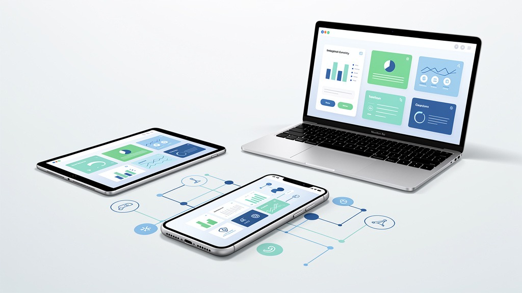
Beyond individual page elements, your site's technical performance significantly impacts user experience and conversion.
Boosting Performance and Site Speed for Better UX
Fast experiences keep high-intent buyers emotionally engaged and moving forward. In an online store, slow load times generate doubt, increase exits from product pages, and frequently lead to cart abandonment before checkout even begins. Performance-focused UX improvements work because speed reduces friction precisely when customers are making purchasing decisions.
Why speed changes customer behavior
Page load times refer to the seconds it takes for key content to become usable on screen, especially on mobile. When mobile performance lags, taps feel delayed, images appear late, and confidence diminishes. Use data analysis to connect speed with customer behavior, identifying where users abandon product pages or stall after adding items to cart.
Steps to improve performance without breaking the design
- Define performance budgets for templates – home, category, product pages, cart, checkout – and treat these budgets as release gates.
- Measure baseline speed per template and per device class, then tackle the slowest, highest-revenue paths first.
- Reduce page weight by improving image delivery, limiting heavy scripts, and loading non-critical elements after primary content.
- Validate third-party tags and personalization, as each add-on can trade richer experiences for slower interactions.
- Re-test after every deployment, with ownership shared among design, development, and analytics teams.
Constraints and safeguards
Performance work can reveal trade-offs between immersive visuals and responsiveness. Protect gains by monitoring key user flows, not just single pages, because real users navigate across multiple templates.
Even with improved product pages and fast loading speeds, a cumbersome checkout process can still deter potential buyers.
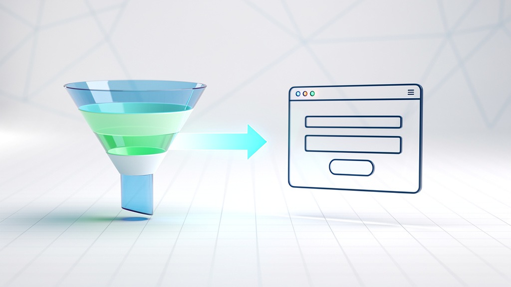
Simplifying the Checkout Process to Drive Conversions
A streamlined checkout process is where high-intent buyers stop browsing and begin purchasing. In a website conversion case study, checkout wins often stem from removing friction, rather than adding persuasion, ensuring the buying journey feels seamless across mobile and desktop.
What streamlined checkout means in practice
Streamlined checkout is a flow characterized by fewer decisions, fewer fields, and fewer opportunities for errors. The goal is to preserve momentum initiated on product pages and convert that intent into completed orders, without unexpected steps or unclear totals.
Steps to reduce cart abandonment
- Map the current buying journey using data analysis, including drop-off points and error events, to capture customer insights.
- Remove non-essential form fields, and defer "nice-to-have" details until after purchase whenever possible.
- Offer guest checkout, then invite account creation after payment to maintain intuitive flow.
- Use clear progress cues and strong inline validation to prevent frustrating rework, especially on mobile.
- Focus on transparent costs early, including shipping and taxes, to reduce last-step hesitation.
Measurement and ownership for redesign teams
Track conversion rates per step, payment failures, and support tickets to validate redesign results and defend redesign ROI. Trade-off: adding payment options can boost conversions, but each option increases QA complexity. So assign clear ownership to design, engineering, and analytics.
While focusing on these improvements, be aware of common pitfalls that can derail even well-intentioned redesign efforts.
Avoiding Common Pitfalls in Redesigns
A profitable redesign isn't won in a mood board. It's won by avoiding the predictable mistakes that derail redesign results. The fastest way to protect redesign ROI is to pair emotionally resonant, brand-right visuals with disciplined usability decisions for high-intent buyers across the buying journey.
Redesign triggers that often hide deeper problems
Teams typically initiate a redesign due to outdated design, poor mobile performance, high bounce rates on product pages, or rebranding that alters the online store story. The pitfall lies in treating these triggers as purely visual issues, when the real friction often resides in slow load times, unclear information hierarchy, and checkout that demands commitment before trust is earned.
Workflow tip: assign one owner for data analysis and one owner for experience design, ensuring customer insights translate into shippable decisions.
Why redesigns fail and how to prevent it
Redesigns often miss targets when objectives are vague, aesthetics are valued over usability, or research is skipped. Prevent failure by defining conversion rates as a measurable outcome, mapping the buying journey step by step, and writing acceptance criteria for product pages and checkout changes before design commences. Use conversion strategies to focus effort where high-intent buyers hesitate most, not where internal opinions are loudest.
Validate changes with testing and monitoring
A/B testing is the safest way to validate conversion choices, as it compares new design against a control without guesswork. After launch, continuous monitoring is crucial: track customer insights, review funnel drop-offs weekly, and iterate UX improvements so the redesign continues to generate returns rather than drifting – a hallmark of any credible website conversion case study.
Addressing these challenges proactively ensures your redesign delivers tangible results, as demonstrated by the following frequently asked questions.
Technical SEO Considerations During a Website Redesign
A redesign can silently erase organic visibility if Technical SEO isn't meticulously planned, even when UX improvements boost on-site conversion rates. In a website conversion case study, such traffic loss can disguise genuine wins, transforming redesign ROI into a misleading narrative. Protecting discoverability is an integral part of credible redesign results, not an optional add-on.
Why redesigns break organic growth
During a redesign, URLs change, templates change, and content moves. Without deliberate mapping, high-intent buyers encounter dead ends before reaching product pages or checkout, disrupting the buying journey on both mobile and desktop.
Technical SEO checklist for redesign safety
- Build a comprehensive URL inventory and redirect map, then implement 301 redirects for all retired URLs.
- Migrate metadata consistently – titles, headings, and internal links, not just page copy.
- Preserve URL structure where feasible, or meticulously document new rules for consistency.
- Validate indexability settings after launch, including robots directives, canonicals, and sitemaps where applicable.
- Run pre- and post-launch data analysis focused on organic landing pages, load times, and customer insights.
Trade-offs and ownership
SEO-safe migrations can extend launch timelines but significantly reduce the risk of losing high-intent sessions that fuel conversion strategies.
Next, we'll cover frequently asked questions about redesigns.
Frequently Asked Questions About Redesigns
How can a redesign increase revenue
Q: How can a website redesign increase revenue? A: Revenue grows when a redesign reduces friction across the buying journey, particularly on product pages and within checkout. The most credible redesign results stem from pairing emotional clarity in design with data analysis that targets conversion rates for high-intent buyers.
- Key levers: clearer product information, more persuasive visual hierarchy, fewer checkout steps, and faster load times on mobile.
- Evidence to capture: funnel drop-off rates, add-to-cart rates, checkout completion rates, and customer insights derived from session recordings or surveys.
- Caveat: visual upgrades that neglect performance and navigation can increase bounce rates without boosting sales.
Q: What improvements would you prioritize when traffic is steady but revenue isn't? A: Focus on conversion improvement over top-of-funnel acquisition. Concentrate on UX improvements that remove hesitation where buyers make decisions, such as clear size guidance, shipping transparency, and trust cues positioned near the purchase button.
What is the 80 20 rule and how to use it
Q: What is the 80/20 rule in redesigns? A: The 80/20 rule represents a focus mindset: concentrate effort on the small set of changes most likely to influence outcomes significantly. In practice, many teams apply it by improving the few screens that control the majority of revenue – typically top product pages and checkout.
- Quick decision rule: improve the pages with the highest traffic and highest abandonment rates first.
- Trade-off: focusing solely on the winners can delay improvements for long-tail categories.
- Workflow tip: assign one owner for insights and prioritization, and one owner for implementation quality.
Q: Which conversion strategies tend to deliver the fastest learning? A: Start with clarity and speed. Reduce load times on mobile, then refine messaging and layout to align with high-intent buyers' expectations.
How to validate changes with testing and keep improving after launch
Q: What role does A/B testing play in a redesign? A: A/B testing validates whether a design change improves conversion rates compared to a control experience. Use A/B tests for high-impact elements like product page layout, call-to-action placement, and checkout steps. Limit each test to one primary change to ensure interpretable results. A/B testing is most reliable when the success metric is defined upfront and the test runs long enough to avoid misleading swings.
Q: How has UX impacted the sector after launch day? A: UX impact is sustained through continuous monitoring and improvement. Track core journeys weekly, review customer insights monthly, and treat post-launch refinement as an integral part of redesign ROI, not a bonus task. This ensures the redesign continues to compound its benefits like a living website conversion case study.
In summary, a successful redesign is a multifaceted project that, when executed correctly, can lead to significant business growth.
Key Takeaways for Driving Website Redesign ROI
The ROI lesson from redesign work
The strongest redesign results emerge from a strategic, data-led focus on the entire buying journey, rather than merely a visual refresh. When conversion improvement aligns product pages, checkout, and mobile devices, redesign ROI becomes a measurable business story, not a subjective design debate.
What to repeat in your next redesign
Use conversion strategies rooted in robust data analysis and customer insights:
- Reduce friction on product pages for high-intent buyers.
- Shorten checkout without compromising reassurance.
- Improve load times to protect conversion rates on mobile.
Ownership and caution
A credible website conversion case study explicitly names who owns measurement, UX, and quality assurance, because gaps in these areas can create misleading wins. A redesign can elevate UX improvements while still underperforming if tracking breaks or key flows aren't tested end-to-end.
This concludes our deep dive into redesign results.