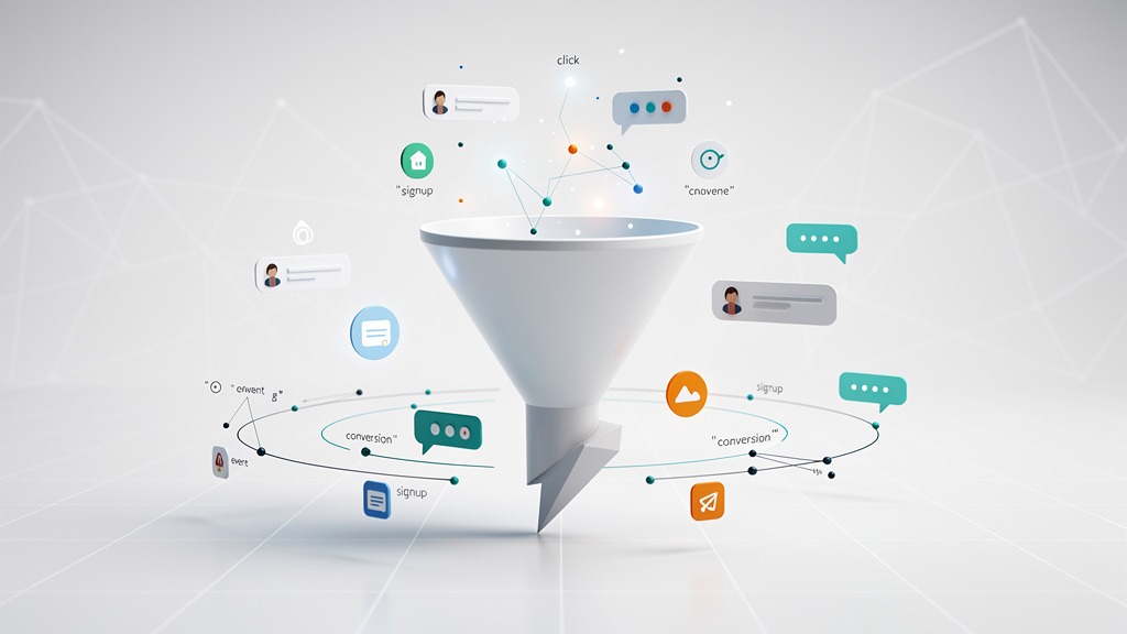
SaaS Website UX Improvements Reduce Churn by 45 Percent
Understanding SaaS Website Optimization and UX Design Improvements
Look, SaaS website optimization isn't rocket science, but it's not exactly simple either. It's this strategic dance where you're constantly tweaking your website's functionality and user experience so more visitors actually become customers—and here's the kicker—more customers stick around instead of disappearing into the digital void.
The business goal? It's brutally measurable: slash friction, boost your SaaS conversion rate, and keep people engaged through journeys that actually make sense. If you're running a SaaS business or handling the marketing side, UX isn't some pretty decoration you slap on at the end. It's a revenue lever that directly impacts whether people stay or bail.
What UX improvements actually mean on a SaaS website
UX improvements are those deliberate, thoughtful changes that transform your SaaS user experience from confusing to intuitive. From exhausting to energizing. From "what the hell am I supposed to do here?" to "oh, this makes perfect sense."
In practice, these improvements zero in on three core areas: clarity (users instantly grasp your value), simplicity (fewer steps and decisions to stress about), and control (users can explore, compare, and backtrack without feeling trapped).
Here's a mental model that actually works: treat each page like you're testing a hypothesis about what users need. Then validate or completely revise based on real evidence, not what you personally prefer or what your CEO's nephew thinks looks cool.
How optimization connects to revenue and retention
Better user experience supports your business metrics by eliminating those sneaky drop-off points that quietly murder your conversion rates and erode trust. When your onboarding actually delivers what you promised during signup, engagement climbs. Retention usually follows.
But here's a trade-off worth watching: overly aggressive conversion tactics might pump up your sign-up numbers while completely destroying long-term satisfaction. You want to optimize for qualified action, not just clicks from random people who'll never pay you.
A practical workflow for data-driven UX changes
I've seen this work across dozens of SaaS companies. Use this repeatable loop:
First, dig into user behavior analysis—funnels, click paths, support tickets that reveal where people get stuck. Next, identify the areas screaming for improvement (confusing steps, unclear value propositions, pages that lead nowhere). Then validate your hunches with actual user feedback and usability testing. Finally, implement changes and confirm the impact with proper A/B testing.
Workflow hint that'll save you months of frustration: assign one person to own insights (analytics), another for decisions (product marketing), and someone else for execution (design and development). Without clear ownership, progress stalls faster than a car in Minnesota winter.
Navigation and page structure that reduce friction
Simplify your navigation by sticking to four to six top-level items max. Use language your audience actually speaks, not industry jargon that sounds impressive in boardrooms. Keep one crystal-clear "start here" path.
Your homepage layout should guide users toward a primary call-to-action with a compelling value statement, solid proof, and exactly one next step. Structure your pricing and feature pages for effortless comparison—consistent labels, scannable sections, decision-focused FAQs that actually answer real questions.
Building on this foundation, let's explore how conversion optimization specifically impacts SaaS success.
Conversion Rate Optimization for SaaS Explained
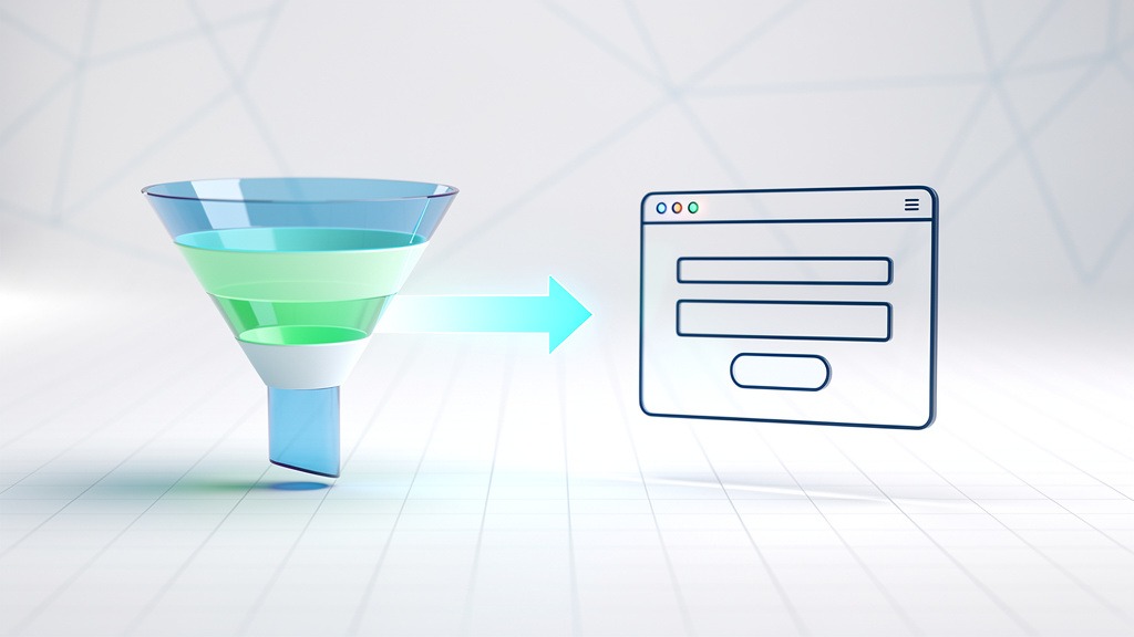
Conversion Rate Optimization for SaaS is the disciplined art of transforming more website visitors into sign-ups, demo requests, and paying subscribers. You do this by reducing friction and strengthening decision confidence throughout the entire journey.
CRO bridges SaaS and user experience to actual business metrics, because smoother journeys typically translate to higher revenue and stronger retention. This isn't a design "polish" project you tackle when everything else is done—it's a strategic loop of analyzing data, spotting improvement opportunities, and implementing changes that make your product feel easier to choose and easier to start using.
What CRO means in the SaaS business model
CRO for SaaS focuses on conversion points that are uniquely challenging in subscription funnels. Think free trial activation, freemium upgrades, demo request flows, and paid plan checkout processes.
A strong SaaS conversion rate usually signals two things: visitors understand your value quickly, and the next step feels safe and intuitive. They're not sitting there wondering if they're about to make a terrible mistake.
CRO also connects short-term wins with long-term outcomes in fascinating ways. When visitors have fewer "wait, what?" moments, onboarding starts cleaner, your support team gets fewer confused tickets, and customers are way more likely to stick around. That's where UX design improvements become measurable not just as clicks, but as retention and lifetime value.
The CRO workflow: analyze, diagnose, implement, validate
Use this repeatable process so your decisions are anchored to evidence, not opinions or gut feelings that might be completely wrong.
Analyze data first. Review acquisition sources, page-level drop-offs, and key funnel steps (homepage to pricing, pricing to sign-up, sign-up to activation). Look for patterns that tell stories about user behavior.
Identify problem areas. Hunt for confusion signals like high exit rates, repeated back-and-forth navigation patterns, form abandonment that makes you want to cry.
Implement targeted changes. Refine messaging hierarchy, tighten navigation, remove unnecessary steps, improve page functionality, and clarify calls to action so they actually call people to action.
Validate the impact. Compare performance before and after changes, and document what shifted so your team can replicate wins instead of accidentally breaking things that were working.
Workflow reality check: assign one person to own analytics and another to handle design execution. Agree on a single success metric for each test before you start. Here's a practical constraint that'll save your sanity—changing multiple elements simultaneously makes results nearly impossible to interpret, even when overall performance improves.
What a good SaaS conversion rate looks like and where to focus first
Honestly? A "good" SaaS conversion rate depends on your funnel type (demo request vs. free trial), traffic intent, price point, and how new your category is to the market.
Instead of chasing some industry benchmark you can't verify, establish your baseline. Then improve one step at a time with clear acceptance criteria that everyone understands.
Focus on pages that shape perception and commitment:
Homepage: Value proposition clarity, first-click path, and emotional trust signals that make people feel confident about moving forward.
Features page: Scannable benefits, clear outcomes, and objections addressed before people even think to ask them.
Pricing page: Plan clarity, risk reduction, and strong social proof (testimonials, logos, reviews) used honestly, not manipulatively.
Trade-off to manage carefully: more persuasive experiences often require additional content and visual elements, but too much can slow decision-making or clutter navigation. Keep the journey purposeful, not overwhelming.
While CRO maximizes immediate actions, it's crucial to understand how it relates to long-term visibility.
CRO Versus SEO Understanding the Key Differences
What separates CRO from SEO
CRO focuses on increasing the percentage of visitors who take meaningful action—starting a trial, requesting a demo, upgrading their plan. SEO is about increasing qualified organic visibility so the right people find your page initially.
CRO and SEO are distinct parts of website optimization, and the strongest SaaS teams design them to work together rather than compete for resources and attention.
How each discipline measures success
SEO success gets judged by organic traffic quality and page intent alignment. CRO focuses on business metrics tied to actual outcomes that matter to your bottom line.
When a SaaS business sees declining conversion rates, CRO asks, "Where does confidence drop?" Then it improves functionality, messaging, and navigation so users can move forward without hesitation or confusion.
SEO improves reach and discoverability. CRO improves decision clarity and user experience. Both rely on analyzing data, identifying improvement opportunities, and implementing changes based on evidence.
Practical trade-offs and ownership
Marketing teams often own SEO strategy, while CRO typically gets shared between UX, product, and growth teams.
A common constraint that kills results: misalignment between teams. An SEO landing page might attract perfect clicks but still fail miserably if the page flow creates friction after the click. The traffic arrives, but the experience doesn't deliver.
With this foundation clear, let's explore the practical rules that guide effective UX design.
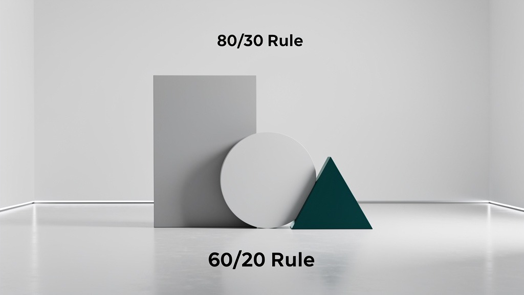
Foundational UX Rules The 80/20 and 60/30/10 Principles
What UX improvements actually mean for SaaS websites
UX improvements are purposeful changes to your SaaS website's navigation, content, and functionality that reduce friction and increase decision confidence. In SaaS conversion optimization, these improvements translate design effort into business metrics like sign-ups, demos, and retention—without guessing what actually matters.
The goal isn't making things prettier. It's making them work better for real people trying to solve real problems.
Evidence-driven prioritization methods
Prioritization should start with user feedback, behavior analysis, and usability testing. Collect qualitative input through support tickets and surveys. Validate it by analyzing data like funnels and drop-offs. Then confirm fixes with usability sessions and A/B testing.
Here's a workflow hint that works: marketers often own messaging tests, while product design owns interaction clarity. Both should agree on the success metric before implementing any changes, or you'll end up arguing about results later.
The 80/20 rule for feature and page focus
The Pareto Principle serves as a prioritization lens: a small set of pages, messages, or interactions often drives the majority of your outcomes. Use this rule to identify areas requiring immediate attention—like a confusing pricing page or broken trial onboarding—then focus your best effort there first.
Trade-off worth noting: over-focusing on one flow can delay smaller fixes that would boost overall user engagement. Balance is key.
The 60-30-10 rule for visual hierarchy
The 60-30-10 rule creates clear visual hierarchy: 60 percent primary surfaces (backgrounds), 30 percent secondary structure (sections), 10 percent accent colors (CTAs and important elements).
This supports clarity, simplicity, and user control by guiding attention to the next best action without creating visual noise that confuses or overwhelms people.
Understanding these principles is step one. Next, let's outline actionable strategies to implement them effectively.
Implementing Six Key Optimization Tactics for SaaS Websites
Strategic website optimization works best as a repeatable loop: analyze data, identify problem areas, implement changes that reduce friction. When SaaS business owners and marketers tie each change to business metrics, the work stays focused on outcomes like revenue and retention rather than opinions or aesthetic preferences.
The goal? A more intuitive navigation path that helps visitors feel confident quickly.
Step 1 Set a measurable baseline before changing anything
Define the conversion events that actually matter—trial starts, demo requests, plan upgrades—and map them to each page's purpose. Then review analytics, session replays, support tickets, and sales call notes to pinpoint exactly where users hesitate or get confused.
This is the practical foundation for SaaS website optimization that protects teams from endless redesign cycles that don't improve results.
Step 2 Implement six high-impact tactics for SaaS conversion optimization
Clarify the primary path. One dominant call to action per page section, supported by secondary actions that don't compete for attention. Reduced friction typically lifts SaaS conversion rates over time, but it takes discipline to resist cluttering pages with multiple competing options.
Upgrade first-click navigation. Rename menu items to match user language instead of internal company jargon. Add a "Use cases" or "Solutions" route when visitors arrive with different intent levels and needs.
Replace static screenshots with interactive demos. Tools like Navattic or Arcade let prospects experience your product story instead of trying to interpret boring screenshots. People understand better when they can click around and explore.
Use video to explain complexity and build trust. A short feature walkthrough can make functionality feel tangible and approachable, especially for multi-step workflows that seem intimidating in text descriptions.
Add AI-powered chatbots and personalization. Use intent-based prompts (role, company size, specific goals) to route people to the right proof points and next steps for their situation.
Strengthen proof where doubt spikes. Add security notes, onboarding expectations, and outcome examples near pricing and sign-up moments where people naturally feel most hesitant.
Step 3 Validate and document what actually worked
Run A/B tests when traffic volume allows, or use staged rollouts when volume is limited. Assign clear ownership: design leads craft UX improvements, growth owns measurement and analysis, product confirms technical feasibility.
Log results as detailed case studies so future iterations can improve SaaS user experience without repeating expensive mistakes or accidentally breaking things that were working well.
Even with solid strategies, common mistakes can derail progress. Let's identify and avoid them.
Common Mistakes in SaaS Website UX Optimization and How to Avoid Them
SaaS website UX optimization fails most often when teams treat design as a surface refresh instead of a strategic optimization system tied to business metrics. A stronger SaaS user experience reduces friction, which typically improves conversion rates, retention, and ultimately revenue.
The fastest path to results? A disciplined loop of analyzing data, identifying problem areas, and implementing changes that users can feel immediately.
Mistake One Designing for opinions instead of measurable outcomes
A SaaS business owner and marketer can both be "right" in a meeting and still be completely wrong in the actual funnel where real users make real decisions.
What goes wrong: Pages get prettier, but functionality stays confusing, so conversions stall and retention slips. You've optimized for aesthetics instead of results.
How to avoid it: Define one primary intent per page (trial signup, demo request, pricing comparison) and one success metric. Then evaluate every UX design decision against that specific intent, not against personal preferences or what looks cool.
Mistake Two Fixing symptoms while ignoring friction hotspots
Teams often rewrite copy or swap visuals without addressing the exact moment users hesitate or get confused.
What goes wrong: Navigation labels feel clever and creative, but visitors can't predict where a click will actually lead them. Uncertainty kills conversions faster than almost anything else.
How to avoid it: Map the complete path from entry page to activation. Then prioritize the step with the highest drop-off rate. Reduce required inputs, clarify next steps, and make critical actions visually dominant so they're impossible to miss.
Mistake Three Shipping changes without a feedback loop
Optimization becomes fragile when "launch" gets treated as the finish line instead of the starting point for measurement.
Start by analyzing data to locate leaks in your funnel—entry pages, form steps, pricing pages where people bail out. Translate those leaks into specific hypotheses about what's confusing, slow, or distracting. Then implement changes in small, reversible iterations, with clear owners for design, engineering, and quality assurance.
Trade-off to manage: faster iterations can increase visual inconsistency across your site, so maintain a lightweight UI and content checklist to protect overall cohesion without slowing down progress.
To consolidate our understanding, let's address frequently asked questions about SaaS website optimization.
Frequently Asked Questions About SaaS Website UX Optimization
SaaS website optimization succeeds when your website feels intuitive, fast, and trustworthy, and when that improved user experience actually moves business metrics like revenue and retention. The goal isn't visual novelty or winning design awards—it's reducing user friction so more visitors convert and more customers stay engaged long-term.
The FAQs below answer the most common questions we hear from SaaS business owners, marketers, and web teams responsible for delivering real outcomes.
UX improvements and why they matter for business metrics
Q: What are UX improvements, really?
A: UX design improvements are purposeful changes to navigation, content, and functionality that make your SaaS user experience feel more seamless and confidence-building. When friction drops, conversion rates often rise, and retention typically improves because customers feel in control rather than confused or overwhelmed.
Q: How does better user experience actually connect to revenue and retention?
A: Better user experience supports business metrics by increasing sign-ups, demo requests, and activation rates, while reducing churn drivers like uncertainty and missed expectations. Here's the key insight: teams that map each UX change to a measurable outcome make website optimization more accountable and less subjective than teams that optimize based on opinions.
Data, diagnosis, and implementation workflow
Q: What's the process for optimizing a SaaS website without just guessing?
A: Use a systematic loop of analyzing data, identifying problem areas, implementing changes, then re-measuring results. A practical constraint to remember—changing multiple elements simultaneously can hide what actually caused the improvement or decline in performance.
Start with user behavior analysis to see where users drop off, hesitate, or get stuck in loops. Prioritize the highest-impact pages in the customer journey like homepage, pricing, and signup flows. Ship one meaningful change at a time, then validate results using the same metrics you used for baseline measurement.
Q: Who should own SaaS website optimization work?
A: Ownership works best as a collaborative partnership: the UX designer owns experience quality and user flow, the developer owns performance and technical functionality, and the SaaS business owner or marketer owns goals and measurement tracking.
The trade-off is speed versus certainty—faster shipping can mean less clarity on cause and effect relationships, which makes it harder to replicate successes or avoid repeating failures.
Rules and conversion rate optimization for SaaS
Q: What is conversion rate optimization for SaaS?
A: SaaS conversion optimization is the practice of improving your website so a higher percentage of visitors take valuable actions like starting trials or requesting demos. The core mechanism involves removing friction points in navigation and decision-making that create unnecessarily low conversion rates.
It's not about tricking people into converting—it's about removing barriers for people who already want to convert but are getting stuck or confused somewhere in the process.
Q: What are the 80/20 rule and the 60/30/10 rule in UX?
A: These rules serve as prioritization frameworks, not rigid laws you must follow perfectly. Use them to focus UX design improvements on the few user journeys that drive most engagement and results, and to craft visual hierarchy that supports clarity and trust throughout the experience.
The 80/20 rule helps you identify which pages or features drive most of your results. The 60/30/10 rule helps you create visual hierarchy that guides attention without overwhelming users with too many competing elements.
In summary, optimizing your SaaS website's UX is a continuous journey with potentially significant returns when done strategically.
Key Takeaways for Reducing Churn Through SaaS UX Improvements
What UX improvements mean when churn is your biggest enemy
UX improvements are deliberate changes to your SaaS website's navigation, content, and functionality that remove friction and increase user control across critical journeys. In practice, SaaS website optimization and UX design improvements reduce the confusion that leads to low conversion rates and early churn, strengthening retention through a calmer, more intuitive user experience.
When people feel confident navigating your site and understanding your product, they're far less likely to abandon ship during those crucial early weeks when churn risk peaks.
What to measure before changing anything about the interface
Prioritize decisions using user feedback, behavior analysis, and usability testing. Then confirm direction with A/B testing that actually measures what matters. A reliable workflow involves analyzing data, identifying problem areas, and implementing changes tied to business metrics like activation rates, upgrade conversions, and support ticket volume.
Ownership clarity matters enormously: SaaS business owners set outcome goals, marketers align messaging with user intent, and UX leads validate flow and functionality. Without clear ownership, optimization projects drag on forever without delivering results.
Principles that keep teams focused on what works
Design for clarity, simplicity, and user control. Make next steps obvious, keep pages scannable, and let users undo or edit choices without penalty. The trade-off is real and constant: adding options can boost flexibility but can also slow decision-making, so test changes progressively rather than making massive overhauls.
How to use website user experience case studies effectively
A credible website user experience case study connects SaaS conversion optimization wins to user engagement and overall website performance, not just aesthetic improvements that look impressive in presentations.
Document what changed, how you measured impact, and what you learned for next time. The best case studies help other teams replicate successes and avoid repeating expensive mistakes.
This concludes our comprehensive guide on SaaS website UX optimization and its impact on reducing churn through strategic, measurable improvements.