
Website Component Libraries and Design Systems for Business Websites
Understanding Website Component Libraries and Design Systems
Here's what most people get wrong about website components: they think it's just about having nice buttons and headers. But honestly? That's missing the bigger picture entirely.
A website component library gives you a toolkit of reusable UI pieces - think buttons, forms, navigation bars, all that essential stuff. A design system? That's your complete playbook. It takes those components and wraps them in guidelines, brand rules, and governance that actually makes sense across your entire digital presence.
For businesses, this shift changes everything. Instead of designing pages one at a time (which, let me tell you, gets exhausting fast), you're building a system that scales without falling apart.
Component library versus design system and how they fit together
Look, the component library is your inventory. Buttons that actually work. Form fields that don't confuse people. Cards, headers, footers, navigation - all the pieces your team grabs when building pages.
The design system? That's your operating manual. It takes your component library and adds the rules: accessibility standards, content voice guidelines, and governance structure. Someone has to decide who gets to approve changes, right?
Reusable elements sit right at the center of both approaches. Your library provides the actual pieces. Your design system makes sure those pieces stay true to your brand when real customers interact with them.
Material Design and Ant Design offer solid examples of how this works in practice. Even when you need something completely custom, these systems show you how structure and documentation should flow.
Why businesses adopt systems instead of designing every page from scratch
Three reasons that actually matter: consistency, speed, and the ability to scale without losing your mind.
Consistency means your customers aren't constantly relearning how to navigate your site. They know where things are. Navigation feels predictable. Your sitemap makes sense, and people can actually find what they came for.
Speed happens when designers stop reinventing layouts for every new landing page. You've got proven components. Just assemble them. Ship faster.
Scalability becomes real when adding new languages, services, or marketing funnels doesn't require a complete redesign. It's controlled expansion, not starting over.
But here's the trade-off nobody talks about upfront: systems need owners. Someone - usually a design lead or product owner - has to approve new components and shut down one-off exceptions before they multiply.
Cost considerations by website type, platform, and scope
Budgeting gets clearer when you separate three things: page count, templates, and integrations. Most cost conversations get muddy because people mix these up.
Your complexity level drives the ranges:
- Campaign microsites and landing pages
- Content hubs and blog systems
- Multi-service business sites
- Full e-commerce with catalog and checkout flows
Platform choice affects everything downstream. WordPress and Shopify can speed up development but add ongoing theme management. Webflow accelerates visual production while keeping components structured. Custom builds match complex workflows better, but expect more upfront investment in design and development coordination.
What moves budgets more than visuals alone? Required integrations (CRM connections, analytics, payment systems) and team experience levels. Agency versus freelancer, local versus remote - these decisions often matter more than whether your buttons have rounded corners.
Branding, visual hierarchy, and credibility
A strong system transforms your color palette, logo guidelines, and typography into patterns that reinforce brand recognition. Visual hierarchy guides attention without creating confusion. Clean graphics make your site feel trustworthy.
One thing to avoid: outdated approaches like splash screens that delay access to content. People came to find something specific. Don't make them wait.
Now that we've covered the foundation, let's dig into the specific elements that make business websites actually work.
Essential Reusable Components for Business Websites
High-performing business sites get built from a surprisingly small set of components that repeat with purpose. When designers treat these elements as genuine components instead of one-off page sections, everything gets faster to build and easier to maintain. Plus, customers experience actual coherence instead of feeling like they're navigating different websites on different pages.
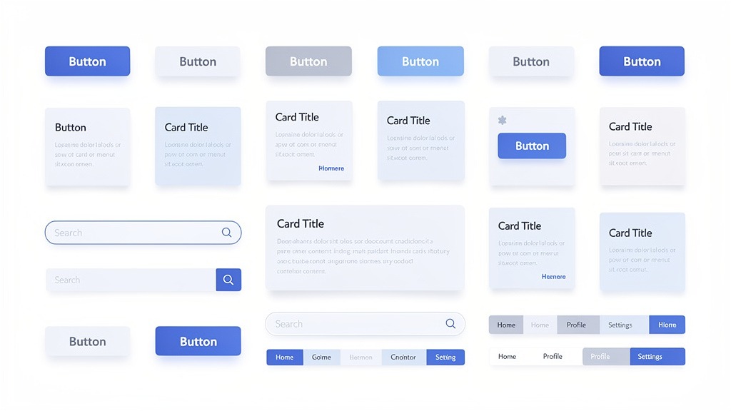
Well-structured components make design systems practical because teams can assemble new pages without redesigning basic layout decisions every single time.
Navigation and header for an intuitive entry point
Your navigation and header components decide visitor success in the first few seconds. No pressure, right?
Strong headers include primary navigation that makes sense, logo placement that reinforces brand recognition, and visible paths to key actions. Contact info, quote requests, whatever matters most for your business.
Keep your sitemap current - both as a planning tool and often as an actual page. Page relationships need to stay clear as content grows. One constraint that breaks everything: unclear labels and crowded menus create friction even when the visual design looks polished.
Hero sections carry your first emotional promise. Use headlines that state value in plain language. Supporting copy should reduce anxiety, not create more questions. Clean graphics need to align with your brand colors and overall identity.
Skip splash screens and flash intros. They interrupt momentum and create accessibility problems. People want information, not entertainment while they wait for information.
Body content sections that carry the story and convert
Content areas should be genuinely modular. Services blocks, About sections, feature highlights - all arranged so you can rearrange without breaking the reading flow.
Build components that support scanning: cards, icon lists, short proof points. The experience needs to work across devices and different reading styles. Some people scan, others read every word.
Calls-to-action deserve component treatment, not afterthought status. Treat each CTA and its landing page as a matched pair. Your CTA promises a next step. The landing page delivers a focused experience that continues the story without distractions.
Trade-off to manage: too many CTAs dilute intent, too few hide the path forward.
Workflow suggestion: business owners should control offers and messaging while designers handle hierarchy, spacing, and interaction states.
Social proof and footer that build trust and close the loop
Social proof components - testimonials, reviews, client logos - reduce perceived risk when placed near decision moments. Next to pricing explanations, after service summaries, wherever people might hesitate.
Keep formatting consistent. Inconsistent social proof creates credibility gaps instead of building trust.
Footer components act as your site's safety net. Secondary navigation, essential contact details, links to important pages. Common failure: footers that look complete but miss the essentials customers search for when they're ready to take action.
Component checklist worth keeping:
- Header navigation with labels that make sense
- Hero with clear message, visual, and primary CTA
- Services and About sections built as swappable modules
- CTA blocks connected to specific landing pages
- Testimonials displayed in consistent patterns
- Footer with contact details, secondary links, utility pages
Understanding these core components matters, but how do you actually implement them effectively?
Building a Custom Website Component Library Step by Step
A custom component library documents your reusable interface elements so teams can assemble pages with consistent navigation, visuals, and behavior. Business owners shouldn't want "more components" - they want faster paths to cohesive brand experiences that customers trust. Designers and developers want fewer one-off decisions and more predictable delivery timelines.
Answer capsule with a step by step build plan
Direct answer: Build your custom library by auditing current content, deciding what needs reusability, then designing, documenting, and implementing components with clear ownership. Treat each component like a product - it needs purpose, rules, and maintenance planning.
Key facts for better decisions:
- Components are "done" when they have design rules, content guidance, and coded versions that match
- Reusability increases when components support multiple contexts, not multiple visual variations
Numbered steps
- Inventory current experience. Screenshot key pages and flows, then map repeating components. Note where interactions break down - inconsistent buttons, unclear states, confusing navigation.
- Define outcomes before UI. Write a brief experience summary: user types, success definitions, brand requirements.
- Align on structure. Draft sitemap and navigation model, then list components needed to support that structure: headers, menus, breadcrumbs, footers.
- Set brand rules. Lock color schemes, typography, spacing, tone so every component expresses consistent brand identity.
- Design components systematically. For each component, define variants and states: default, hover, focus, error, loading.
- Document usage clearly. Add content guidance - when to use components, what to avoid, examples of effective copy.
- Build coded library. Create single source of truth in your codebase, connect to page templates so teams don't rebuild elements.
- Release in phases. Start with highest-impact components, replace old UI gradually to reduce risk.
- Assign ownership. Name someone for requests, reviews, deprecations so the library stays coherent over time.
Quality controls for consistency and accessibility
Component libraries succeed when consistency becomes automatic, not when the library becomes massive.
Skip decorative friction. Motion or splash screens that delay content access often hurt accessibility outcomes because users can't reach information quickly.
Create review checkpoints. Require sign-off on visuals, content rules, interaction states before components get approved for use.
Accept trade-offs upfront. More variants increase flexibility but also increase testing and maintenance effort. Limit variants unless real user scenarios require them.
Quick example and budgeting setup for pricing discussions
Example: B2B consultancy standardizes a "Service Card" component with rules for graphics, icon style, headings, and consistent calls to action. Marketing team launches new service pages by assembling proven parts. Dev team updates one component to refresh the entire site.
For pricing conversations, track:
- Component count and complexity, including all states
- Documentation depth and review cycles required
- Implementation scope across templates and legacy pages
- Long-term maintenance expectations and ownership structure
Building custom libraries offers advantages, but understanding the financial investment helps with planning.
Website Design Costs and Component Library Pricing Models
Website design costs vary because websites aren't single deliverables - they're bundles of strategy, visuals, components, content, and ongoing maintenance. Most reliable budgeting separates page-level work from system-level work, especially when investing in custom component libraries that speed future launches and maintain consistency as businesses grow.

Key points:
- Costs change based on business needs and project scope, not just page count
- Component library and design system work often appears as distinct line items because they support multiple pages and future iterations
- Ongoing costs (hosting, maintenance, updates) can exceed initial build costs depending on how actively sites evolve
Average cost ranges by website type and what drives the range
Pricing varies significantly, so "average" ranges work better as budget bands than universal numbers.
Starter marketing site (few page types, basic integrations): typically lower investment. Primary cost drivers include branding, clean graphics, navigation clarity.
Growth business site (multiple page templates, richer interactions, analytics, SEO foundations): typically mid-range investment. Costs increase with content modeling, accessibility requirements, reusable layouts.
E-commerce site (catalog, checkout, shipping, tax handling, customer accounts): typically higher investment. Platform choice creates very different build patterns and ongoing responsibilities.
Complex product or enterprise site (role-based content, personalization, multi-language, advanced governance): typically highest investment. Expect more time on sitemaps, permissions, QA, performance optimization.
Practical constraint: under-scoping sitemap and navigation often creates hidden rework later because teams end up redesigning flows that should have been defined upfront.
Pricing models compared for web designers and business owners
| Pricing model | Best when | Watch-outs | Who controls scope |
|---|---|---|---|
| --- | --- | --- | --- |
| Hourly | Unknowns are high, discovery still happening | Budget can drift if approvals lag | Business owner and project lead |
| Fixed project | Requirements are clear, timeline is firm | Change requests can trigger add-ons | Designers with signed scope |
| Retainer | Ongoing iterations, campaigns, continuous improvement | Unused hours or vague backlogs waste value | Shared, via monthly roadmap |
Trade-off: hourly protects flexibility, fixed protects predictability, retainer protects momentum.
One-time costs versus ongoing costs for design systems and components
One-time costs typically include strategy, branding (brand identity, color schemes, typography), visual design, component development, initial content entry. Custom component libraries may include interaction patterns, states, documentation that prevents one-off design decisions.
Ongoing costs typically include hosting, security updates, content updates, performance monitoring, new components as customer expectations evolve.
Caution: avoid paying repeatedly for identical UI patterns. If teams rebuild buttons, cards, or forms each sprint, the component library isn't being treated as a shared resource.
Quick example: professional services firm pays once to define components for headers, service cards, testimonial blocks, forms, then reuses them to launch new landing pages without adding splash screens or inconsistent visuals.
Investing in robust design systems impacts quality significantly, but what separates good websites from truly great ones?
Differentiating Good Websites from Great Websites
Great business websites aren't defined by more pages or louder visuals - they're defined by coherence. Great sites align navigation, visual design, and interactions around one outcome: helping customers feel confident enough to take the next step. Bad sites confuse people. Good sites function properly. Great sites feel purposeful from first click through conversion.
- Bad website: unclear paths, distracting elements (including splash screens), mismatched brand signals
- Good website: usable navigation and clean graphics, but inconsistent patterns or uneven content decisions
- Great website: consistent system, measurable intent, fewer surprises for business owners and build teams
Great websites make decisions for the visitor through navigation
Great sites reduce cognitive load by making next actions feel inevitable. Navigation isn't just a menu - it's a promise that visitors won't get lost.
Practical constraint: navigation breaks when page owners keep adding "one more" link for internal politics. Sitemaps help designers protect clarity when stakeholders pull in different directions.
Quick example: Services firm transforms a "good" site into a "great" one by limiting top navigation to tasks customers actually want, then supporting everything else through logical sitemap structure and internal linking.
Great websites translate brand identity into visual designs that feel trustworthy
Great visual design isn't decoration - it's a trust signal. Cohesive color schemes, typography, and clean graphics make experiences feel intentional. That's often the difference between "I'm browsing" and "I'm ready to talk."
Common pitfall: chasing novelty over clarity. Splash screens, overly complex motion, dense layouts can create friction, especially when the goal is sites that load and read well across devices.
Trade-off to manage: stronger brand expression can increase design effort, but inconsistent visuals create bigger long-term costs in rework and diluted perception.
Great websites use systems to improve turnaround time and conversion
The differentiator between good and great is repeatability. Template systems (structured page-building rules and layouts) help teams ship consistent experiences faster without reinventing every page.
Workflow suggestion: assign ownership early. Business owners define priorities and success criteria. Designers define patterns and accessibility rules. Developers enforce consistency in implementation.
Great-website checklist
- Each page has one primary job, tied to conversion goals
- Navigation matches sitemap - no orphan or duplicate paths
- Components behave consistently, including key interaction states
- Visual design reinforces brand identity through deliberate color schemes
- No "special case" pages that quietly expand scope and slow delivery
Questions come up frequently when considering component libraries and design systems, so let's address common ones.
The core concepts of 'Component Libraries' and 'Design Systems' are almost entirely absent. Competitors discuss high-level 'components' (e.g., a contact page) but not the modern, systematic approach to building with reusable UI elements.
Most competitor articles call entire pages "components" (like contact pages) and stop there. That completely misses the modern, systematic approach: business websites become faster and more consistent when teams build from reusable design elements with shared rules, not one-off page layouts. Even when "design system" gets mentioned (digitalpresent.io touches on it briefly), the practical blueprint for designers and stakeholders often disappears.
Why the gap matters for business outcomes
Business owners feel this gap as delays, inconsistent visuals, surprise rework when adding new pages. Customers feel it as friction: navigation that shifts between pages, graphics that suddenly look mismatched, brand identity that fades from section to section.
Component-led approaches keep sitemap and page structure stable while letting teams iterate on details like color schemes and interactions without breaking consistency.
What a systematic approach looks like in practice
Use this checkpoint list to determine whether a vendor sells pages or scalable systems:
- Named set of UI parts (header, hero, cards, forms) with usage rules tied to outcomes
- Documented navigation patterns linked to sitemap structure
- Brand tokens for typography, spacing, color schemes that protect brand identity
- Interaction states defined upfront (hover, focus, error) to avoid late-stage surprises
- Clear "avoid" rules, like skipping splash screens that interrupt user intent
Constraints and trade-offs to plan for
Systems cost more attention early but save decision time later. What can go wrong: too many variants, unclear ownership, "almost the same" components that fragment the library.
Next, we'll map common pricing models for design components so budgeting feels predictable.
There is no specific pricing information related to component libraries or design systems. Competitors cover general website design costs but fail to address the target keyword 'web design components pricing'.
Competitor guides often quote full-site ranges, but that doesn't help business owners compare component pricing across realistic options. Clearer budget conversations separate the system you reuse from the pages you assemble, because business website components drive long-term speed, consistency, and customer trust.
Three pricing paths decision makers actually choose
Free open-source libraries: strong starting point for reusable design elements, but designers still spend time aligning navigation, accessibility, and brand identity requirements.
Paid design system templates: faster setup and cohesive template systems, but teams must adapt color schemes, clean graphics, and patterns to real interaction needs.
Custom build: custom component library tailored to sitemap, content types, and governance needs, but requires upfront design and engineering coordination.
What to check so costs don't quietly expand
Ownership matters. Assign one person to approve components, or "one-off" fixes spread across pages and erode navigable website experiences. Avoid outdated patterns like splash screens, which can complicate performance and clarity.
Quick example for scoping
If website content changes weekly, prioritize flexible components over one-time visual mockups to keep sites coherent and web-friendly.
Next, the FAQ section answers common questions about website components and design systems.
Frequently Asked Questions About Website Components and Design Systems
What are the major components of a business web page
Q: What are the 5 major components of a web page, and what are the parts of a business website?
For most business website components, the "must-haves" map to a predictable customer journey: orient, inspire, inform, reassure, convert. Component libraries help designers build that journey consistently across pages, so customers always know what to do next.
- Navigation and Header: logo placement, primary navigation, clear path to key pages, supported by sitemap for structure and findability
- Hero Section: headline, supporting copy, call to action that matches landing page intent
- Content and Body: core website content like Services and About sections, with clean graphics and deliberate color schemes tied to brand identity and awareness
- Social Proof: testimonials, reviews, logos, case studies that reduce hesitation at decision points
- Footer: secondary navigation, contact details, legal links, repeated trust signals
Caveat: Some industries need additional components (pricing tables, booking systems, compliance notices), but the flow remains consistent.
Q: What are the 4 components of a website?
A practical four-part grouping covers navigation, content, conversion, and trust. The difference isn't the pages themselves, but the reusable design elements that make navigable websites feel consistent in every interaction.
How do the 7 Cs relate to design systems
Q: What are the 7 C's of a website?
Many teams use "7 C's" checklists to keep experiences purposeful, but labels vary by organization. Design systems make any framework actionable by defining how voice, visual patterns, and interaction rules show up in real components.
What to check: clarity of navigation labels, consistency of spacing and typography, whether every page has one primary call to action.
What can go wrong: splash screens or overly decorative motion can distract from messages and slow comprehension, even when visual design looks impressive.
What is the difference between design system templates and website template systems
Q: Are design system templates the same as website template systems?
No. Website template systems provide page starters, while design system templates describe rules and component patterns that keep pages aligned to brand identity as sites evolve. Custom component libraries sit in the middle, giving business owners scalable sets of parts that teams can assemble without redesigning from scratch.
Workflow suggestion: Marketing typically owns messaging and website content, while design and engineering own components and documentation.
How does web design components pricing usually work
Q: How should I think about web design components pricing without hidden surprises?
Component pricing often depends on scope (how many components), complexity (variants and states), and governance (who maintains the system). Budgeting becomes clearer when you separate component work from page assembly, and when you define what "web-friendly website" means for performance, accessibility expectations, and ongoing updates.
Trade-off: More reusable components reduce future build time but require upfront alignment and ongoing maintenance investment.
Let's wrap up with key takeaways from our discussion on website component libraries and design systems.
Key Takeaways for Business Website Design and Development
Great sites get built, not patched together. When business website components are treated as systems, teams ship faster, protect user experiences, and reduce rework that quietly inflates component pricing.
The component checklist that customers feel
Use reusable design elements to keep every page consistent for customers:
- Navigation and Header: clear labels, predictable placement, visible path back home
- Hero Section: focused promise that matches page intent and sets emotional direction
- Content and Body: scannable Services and About website content supported by clean graphics, consistent color schemes, accessible visual design for web-friendly websites
- Calls-to-Action: one primary call to action per landing page to guide decisive interactions
- Social Proof: testimonials and reviews placed near key decisions
- Footer: contact details plus clear sitemap for easy navigation (skip distracting splash screens)
The workflow that prevents surprises
Plan with people who own outcomes: business owners set goals, designers shape visual website experiences, developers implement systems.
- Planning and Discovery
- Information Architecture and Wireframing
- Design and Development
- Testing and Launch
What to do next
Choose between website template systems and design system templates, then invest in custom component libraries when brand nuance and scalability matter. Armed with this knowledge, you're better equipped to make informed decisions for your business website.


